
Checkout That Sells: 9 Fixes for Higher Conversions

Most e-commerce shops lose customers not due to price, but because of the checkout process. Here are 9 specific things you can fix - some even without a developer.
Checkout that sells: 9 fixes for higher conversions

The average e-shop loses 70% of customers right at the checkout. Not due to price. Not due to competition. Due to a form that is too long, mandatory registration before purchase, or a missing payment method. The customer was ready to buy and you lost them in the last three clicks.
If you have an e-shop with traffic, but conversion is stagnating below 2%, this is the article for you. We will go through 9 specific things that stall the checkout and tell you what you can fix yourself and what requires a developer.
Why checkout determines whether the customer pays
The customer who has reached the checkout page has already overcome the biggest psychological barrier, they have decided to buy. At this stage, they are not stopped by the price (they saw that on the product), but friction. Every unnecessary step, every extra field, every doubt about payment security increases the chance that they will close the tab.
According to research by Baymard Institute, which has long monitored online shopping behavior, the average cart abandonment rate is 70.19%. Of that, nearly a quarter of customers leave directly due to a complicated checkout process. This is not a problem of the product or the price — it is a UX problem.
The good news: most of these issues can be identified and fixed without having to rewrite the entire e-shop.

9 things that stall conversions in checkout
1. Mandatory registration before purchase
This is still the most common reason for cart abandonment. The customer wants to buy - not create an account. The solution is simple: guest checkout as the primary option, registration as an optional bonus after completing the order. If your e-shop does not have guest checkout, that is the first thing to fix.
2. Too many fields in the form
Every extra field increases friction. Do you need a name, address, email, and phone? Probably yes. Do you need a date of birth, gender, or how you heard about us? Not at checkout. Go through the form and eliminate every field that you can process the order without.
3. Lack of trust at the moment of payment
The customer sees the payment form and the brain automatically goes into defense mode: “Is this safe? What if they don’t take my money?” Specific elements help: SSL badge, logos of payment methods, a brief return policy (not the entire document, just “30 days no questions asked”), and reviews — ideally visible during checkout.
4. Unexpected fees at the end
The customer adds items to the cart for €49, clicks on checkout, and finds out that shipping is €6.90 and packaging is €1.50. They close the page. The solution: display the total price including shipping as soon as possible, ideally right in the cart. If you offer free shipping over a certain amount, show a progress bar: “You need €12 more for free shipping.”
5. Weak mobile version of checkout
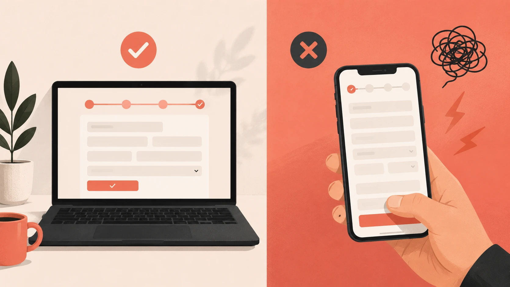
Data consistently shows that mobile traffic accounts for 30–50% of traffic for most e-shops, but the conversion rate on mobile is usually half that of desktop. The reason: checkout was not designed for touch screens. Check the size of buttons (at least 44×44px), the length of forms on mobile, and whether the keyboard does not cover the active field.
6. Few payment options
If you offer only card and bank transfer, you are losing customers who prefer PayPal, Apple Pay, Google Pay, or cash on delivery. In the Slovak market, cash on delivery is still strong, especially for new customers; it is a way to minimize perceived risk. Adding one more payment method can increase conversion by a percentage point.
7. Checkout without a progress indicator
The customer has no idea how many steps are left. They don’t know if they are halfway done or almost finished. A progress bar (Step 1: Delivery → Step 2: Payment → Step 3: Confirmation) reduces anxiety and increases the chance of completion. A simple UI element, a strong effect.
8. Slow loading checkout page
Every second of waiting increases the likelihood of abandonment. According to an analysis by Deloitte Digital “Milliseconds Make Millions”, improving speed by 0.1 seconds leads to an 8% increase in conversions in retail. If your checkout takes more than 3 seconds to load, you probably have too many third-party scripts, unoptimized images, or a slow server.
9. Unclear error messages in the form
“Invalid format,” what does that mean? What do I need to fix? Bad error messages in forms frustrate customers and they eventually give up. Every error message must clearly state what is wrong and how to fix it: “Please enter the phone number in the format 0900 123 456.”
What you can fix without a developer
Some of these points are configurable — you can manage them in the e-shop administration yourself or with minimal help:
- Activating guest checkout (Shopify: natively available, WooCommerce: single setting)
- Removing unnecessary fields from the form
- Adding trust badges and logos of payment methods
- Displaying the shipping price earlier in the process
- Progress bar — most platforms have it built-in or via a plugin
What requires a developer
- Custom mobile optimization of the checkout flow
- Integration of new payment methods (Apple Pay, Google Pay)
- Speed and performance optimization
- A/B testing of checkout variants
- Custom error messages and form validation
How to measure results after changes
Basic metric: conversion rate (orders ÷ sessions × 100). Track it before and after each change — ideally via Google Analytics 4, where you can also see the funnel report with the exact point of customer leakage.
Another useful metric: cart abandonment rate. If it is decreasing, you're going in the right direction. For deeper analysis, we recommend heatmaps — Microsoft Clarity is free and will show you exactly where people are clicking, where they get stuck, and where they leave.
Conclusion
Checkout is not a technical detail; it is the place where it is decided whether a business makes money or not. Most issues that stop customers are visible, measurable, and fixable.
If you are unsure where exactly your checkout is losing people, we would gladly take a look at it together. A free CRO audit will reveal specific points of leakage, no obligation and free of technical jargon.
If you’re dealing with something similar and don’t know where to start, feel free to reach out to us directly — we would be happy to take a look at your specific case. You can contact us via contact form.


Selected projects
Gumotex
Category
E-commerce
Client
GUMOTEX Coating s.r.o.
Duration
4 months

Petmiska
Category
E-commerce
Client
Next Point Company s. r. o.
Duration
2 months

Dr. LUCULLUS
Category
Custom Development
Client
Dr. Lucullus MEDICAL
Duration
March 1, 2025 - present

GUMIDECK - Eshop
Category
E-commerce
Client
GUMIDECK
Duration
2 weeks