Digital Arrow
Kategoria
Website Creation
Klient
Digitálna koalícia
Realizácia
1 month
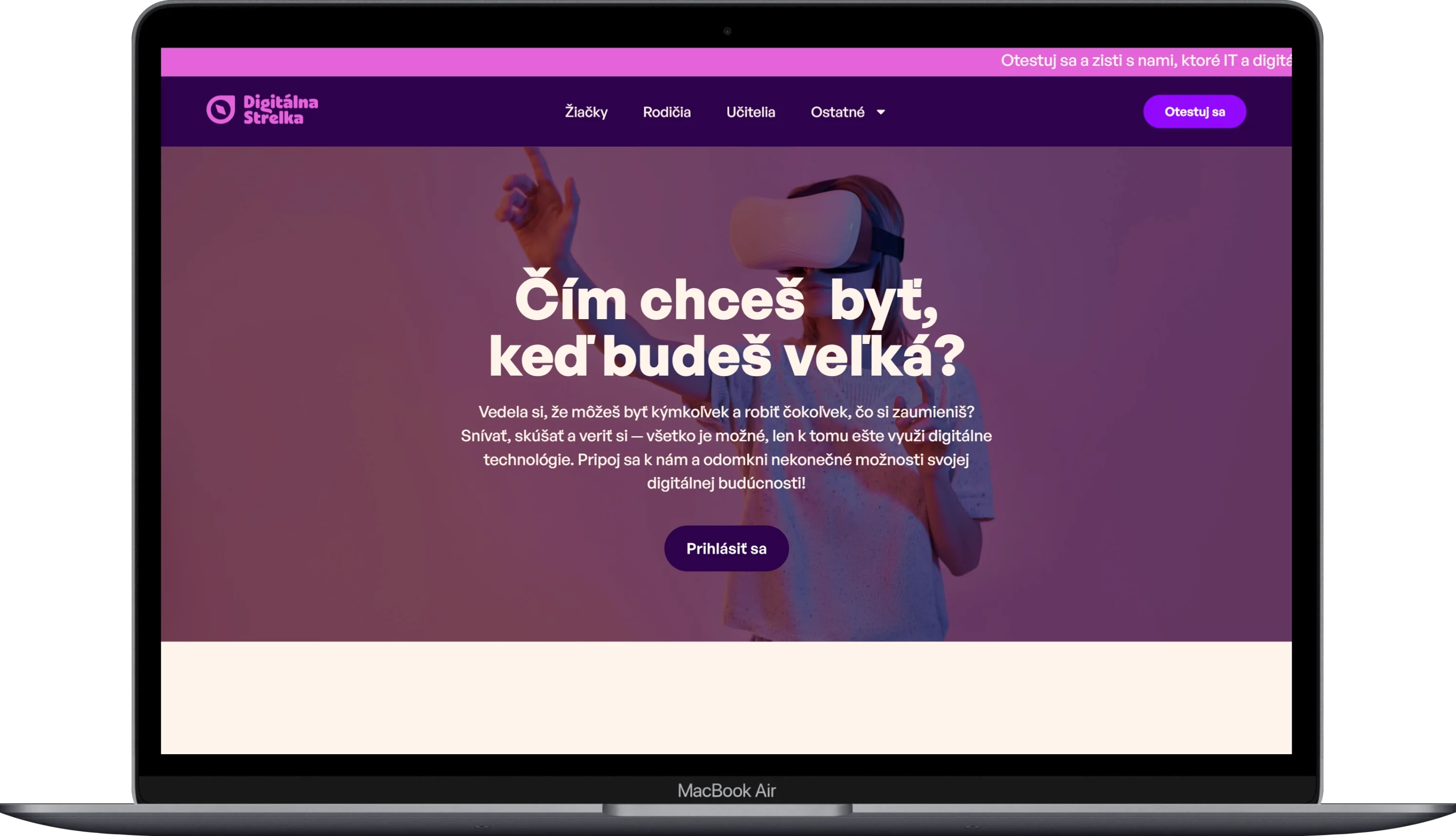
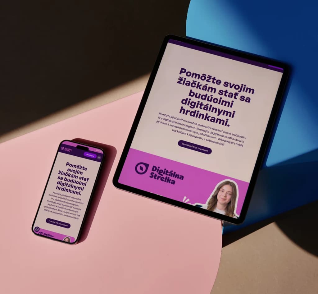
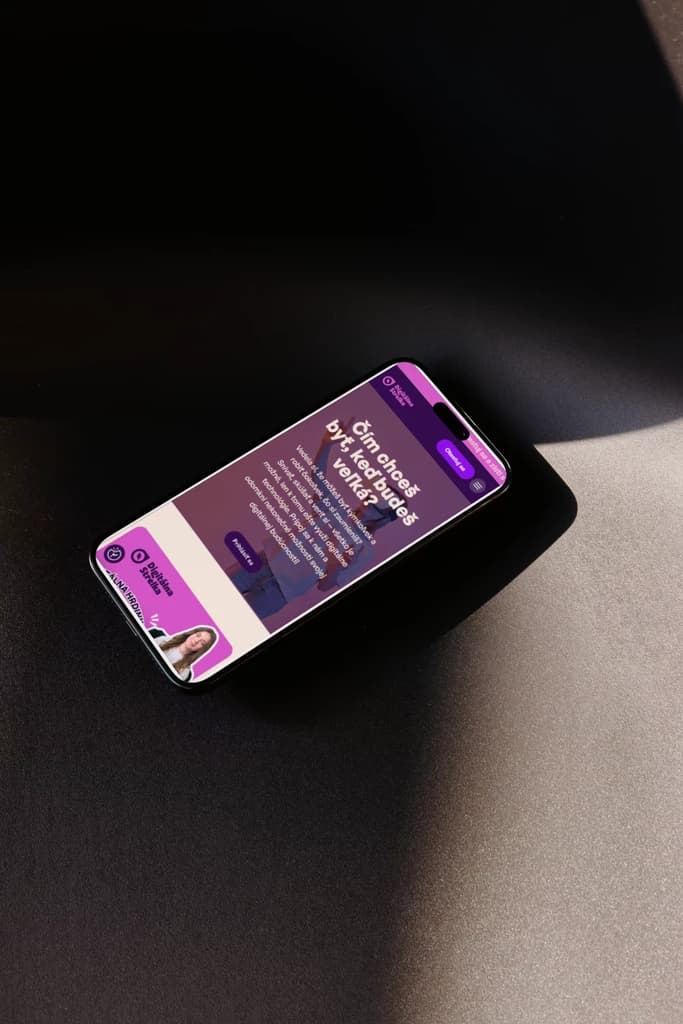
For the Digital Arrow project, we developed a responsive website based on the provided web design aimed at promoting digital skills among girls in Slovakia. The project is initiated by the Digital Coalition, and the website's goal is to inspire young girls, students, parents, and teachers to explore opportunities in the field of IT and digital technologies. During development, we focused primarily on flawless mobile display and loading speed, as most of the target audience accesses the site from mobile devices.
(VÍZIA)
The vision of the project was to create a space where girls feel welcomed and motivated to try new things in the digital world. The website was intended to be not only informational but also inspiring. Visually appealing, fast, and easy to use, so that even visitors without technical experience could instantly understand what the project offers and how they can get involved.
(PROBLÉM)
A key issue was creating a clear school listing. The project needed a tool that would allow students to quickly orient themselves regarding their study options in IT. We implemented a complete list of schools with clear information and filters based on location and focus so that choosing the right school would take just a few clicks instead of hours of searching.
(NÁŠ POSTUP)
We received a complete web design created in Figma as the basis. Our task was to transform it into a functional website with an emphasis on mobile display and performance. Speed was the priority, so we optimized every page to load instantly, even on weaker connections. In addition to standard presentation sections, we implemented a complete school listing with filters, enabling students to quickly find relevant study options in the field of digital technologies.
(POTREBY UŽÍVATEĽA)
Visitors to the Digital Arrow website come with various needs. The student seeks inspiration and specific schools where she can study IT. A parent wants to know what options their daughter has. A teacher looks for materials and events that can be integrated into their teaching. For each of these groups, the website offers a clear path to relevant information, supported by interactive tools and the community aspect of the project.
(VÝZVY)
The main challenge was to transfer the colorful and dynamic design from Figma into code while ensuring that the website remained fast and smooth on all devices. The target audience primarily consists of young girls who visit the site from mobile phones. Every visual animation and interactive element had to work just as well on older phones as on the latest devices, without compromising loading speed.
(USER CENTRIC)
The website is designed for young female users who may be exploring digital technologies for the first time. Therefore, every step on the site is intuitive and straightforward. Navigation is simple, content is structured from inspiration to specific steps, and the entire site functions flawlessly on mobile devices. No confusing menus, no unnecessary subpages. Just a clear path from curiosity to action.
Selected projects
(PROJECT)
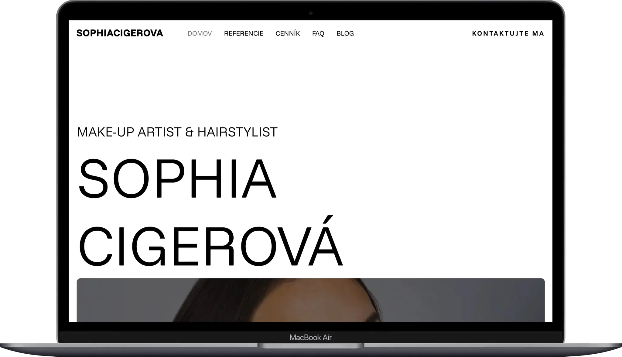
Sophia Cigerova
Kategoria
Website Creation
Klient
Sophia Cígerová
Trvanie
1 week
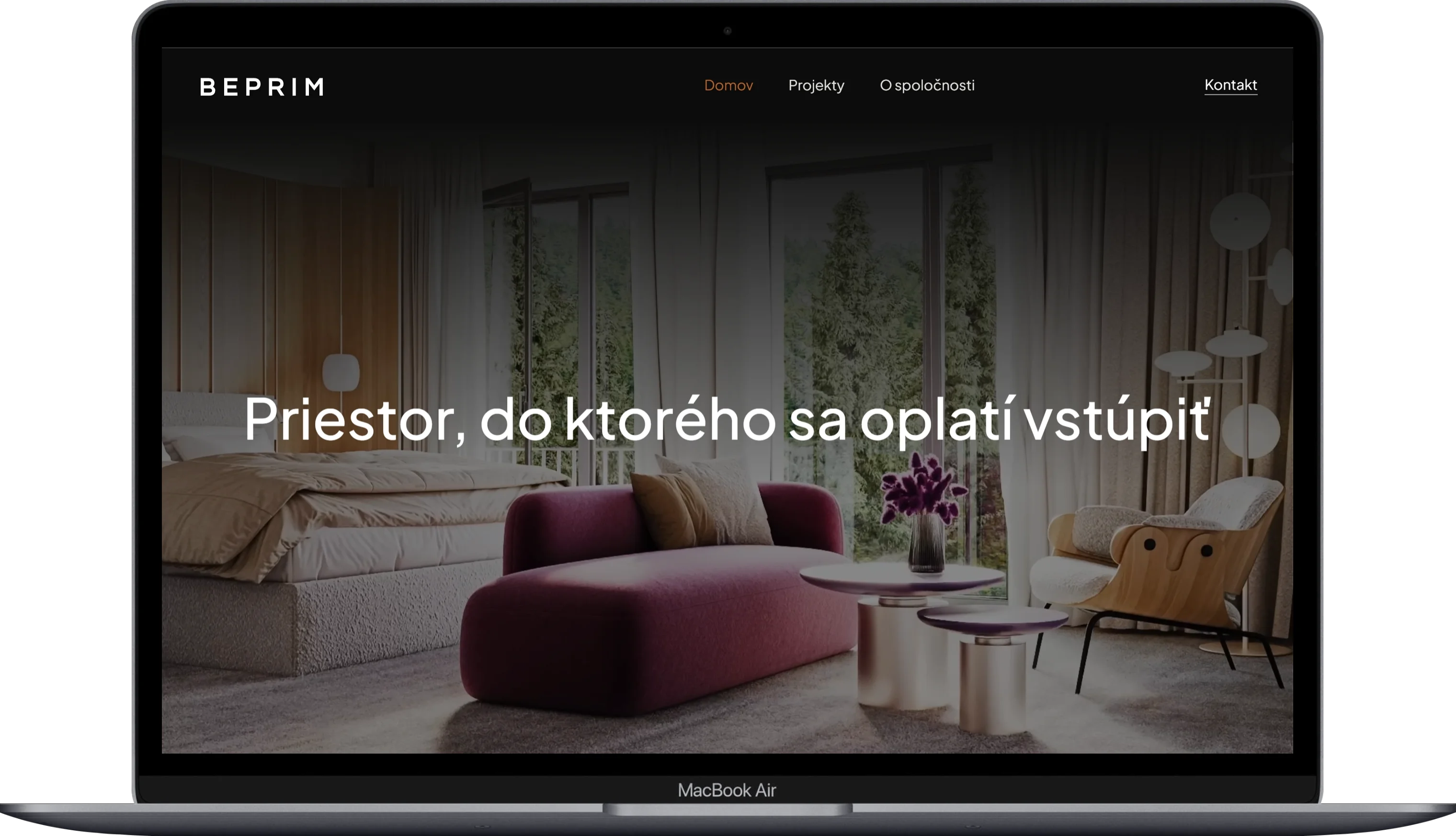
(PROJECT)
BE-PRIM
Kategoria
Website Creation
Klient
BE-PRIM
Trvanie
1 week
(PROJECT)
Harbor Equity
Kategoria
Website Creation
Klient
Harbor Equity a.s.
Trvanie
2 weeks

(PROJECT)
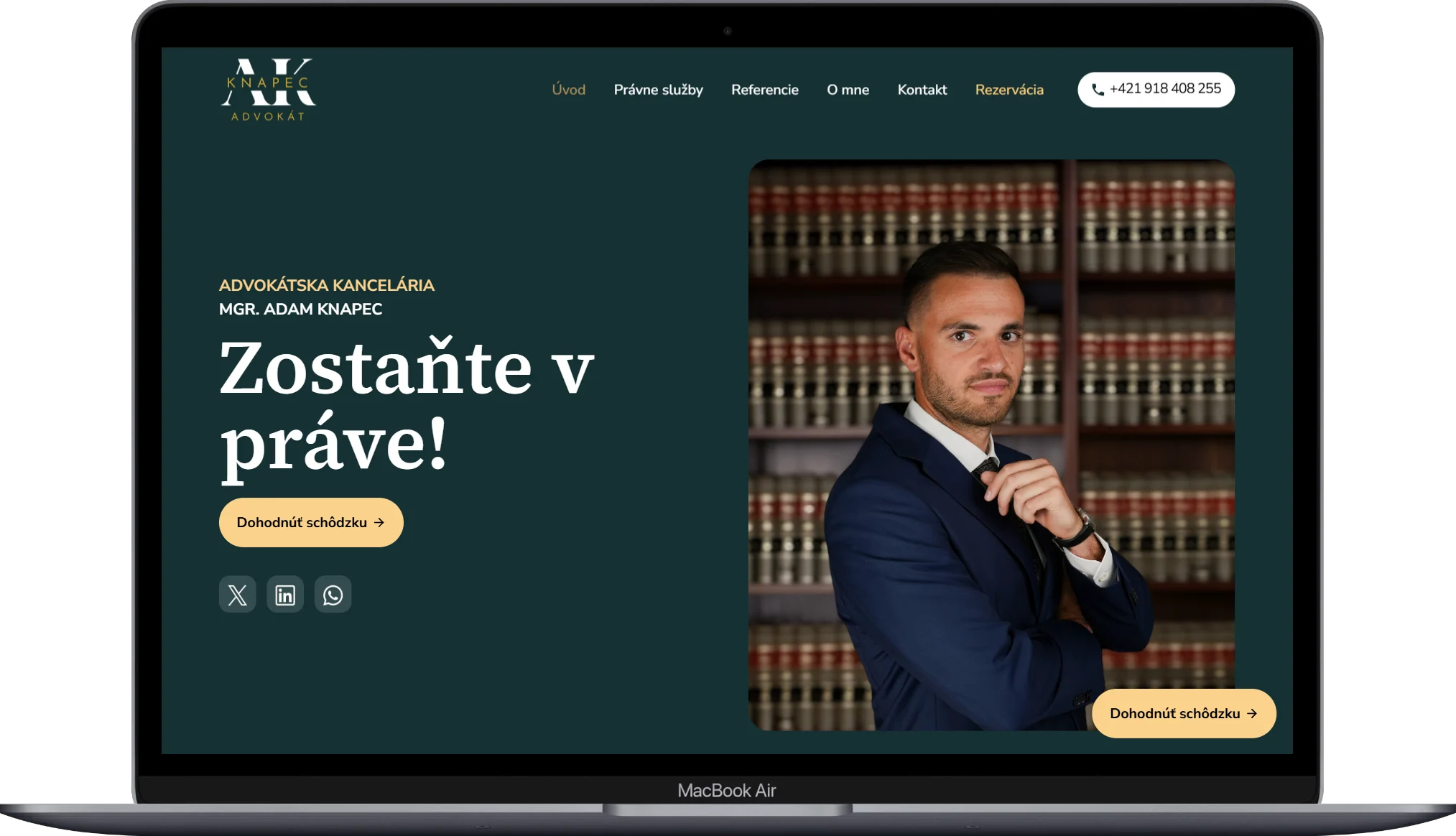
Adam Knapec
Kategoria
Website Creation
Klient
Mgr. Adam Knapec
Trvanie
2 weeks