


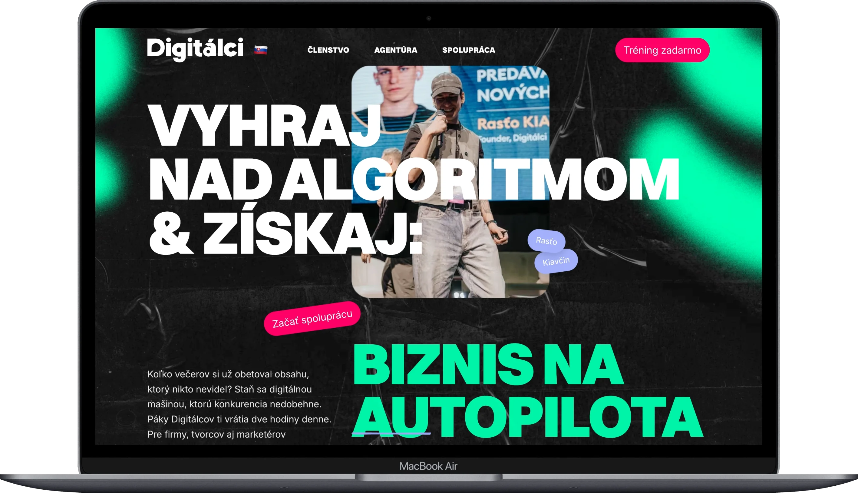
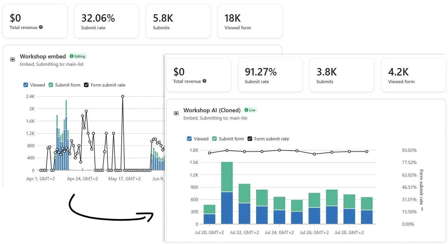
We built a presentation website and sales funnel for Rasťo Kiavčina, the founder of the marketing community Digitálci and co-owner of ToTheMoon Studio. The original website was running on WordPress with Elementor; we replaced it with a completely custom solution in Next.js with plain CSS, supporting three languages, and a live-connected Klaviyo form. The submission rate on the key form increased from 32% to 91%.
(VÍZIA)
The website was meant to function as a digital embodiment of the Kiavčina brand—something that communicates its quality at first glance and distinguishes it from other websites in similar themes (coaches, creators, marketing communities). It also needed to be extremely fast so that the speed of the website reinforces the impression that ‘this brand has things under control’ rather than undermining it with slow loading.
(PROBLÉM)
The original website built on WordPress and Elementor could not keep up with the speed and prominence with which Kiavčina was building his brand on social media. It was slower, visually more generic, and poorly scalable across languages or new sections required by the rapidly growing Digitálci community. Additionally, the signup form had a low submission rate (32%) relative to the number of visitors.
(NÁŠ POSTUP)
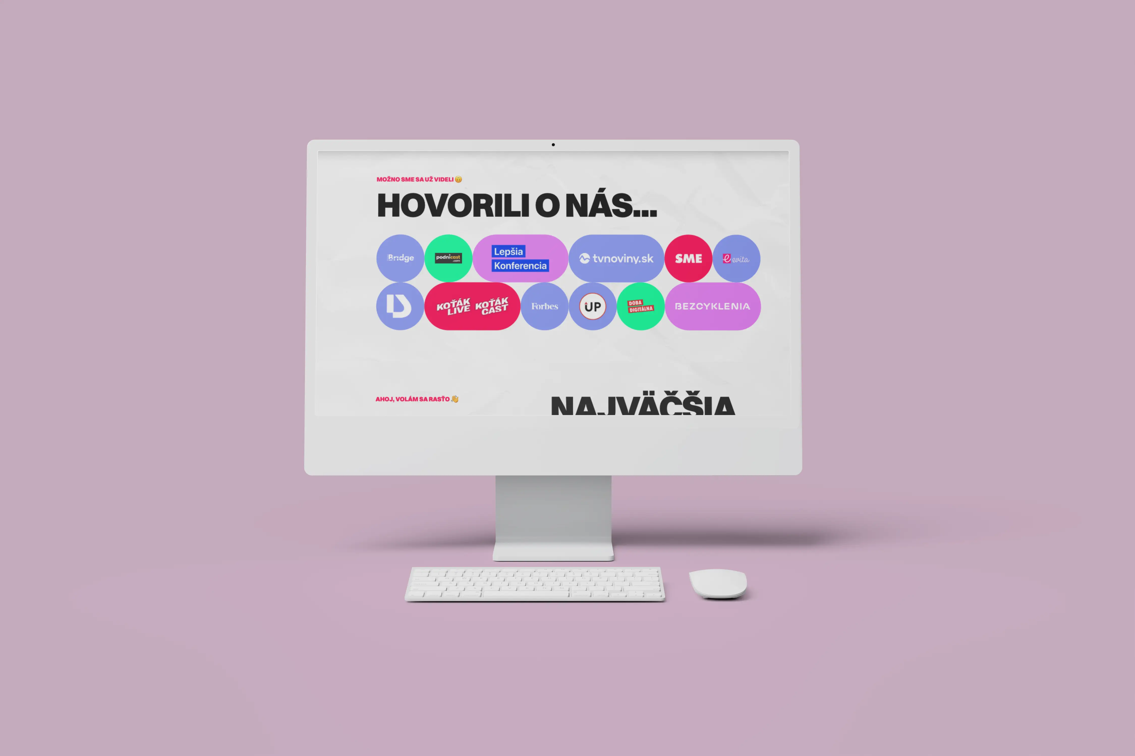
We processed the entire UX design of the website entirely in Figma, from wireframes through information architecture to the final layout of each section, before we began building anything in code. We started from the premise that Kiavčina has a strong, highly recognizable visual identity on social media, so the website had to adapt to it. Instead of a standard template, we built a unified, scalable component system in Next.js that accommodates a flashy design with many absolutely positioned elements while maintaining a readable structure according to common scanning patterns. Simultaneously, we addressed i18n for SK, CZ, and EN (default SK), JSON-LD structured data tailored precisely to the content of individual pages, and direct integration with the Klaviyo API, allowing the client to have real-time insight into form performance without the need for manual reporting.
(POTREBY UŽÍVATEĽA)
Visitors need to understand within seconds who Kiavčina is and why they should trust him, and then seamlessly navigate to the action they are looking for, such as free training, membership in Digitálci, or contacting for collaboration. Given that many visitors come from links in reels and stories, the website must function flawlessly even with very fast ‘scrolling’ behavior.
(VÝZVY)
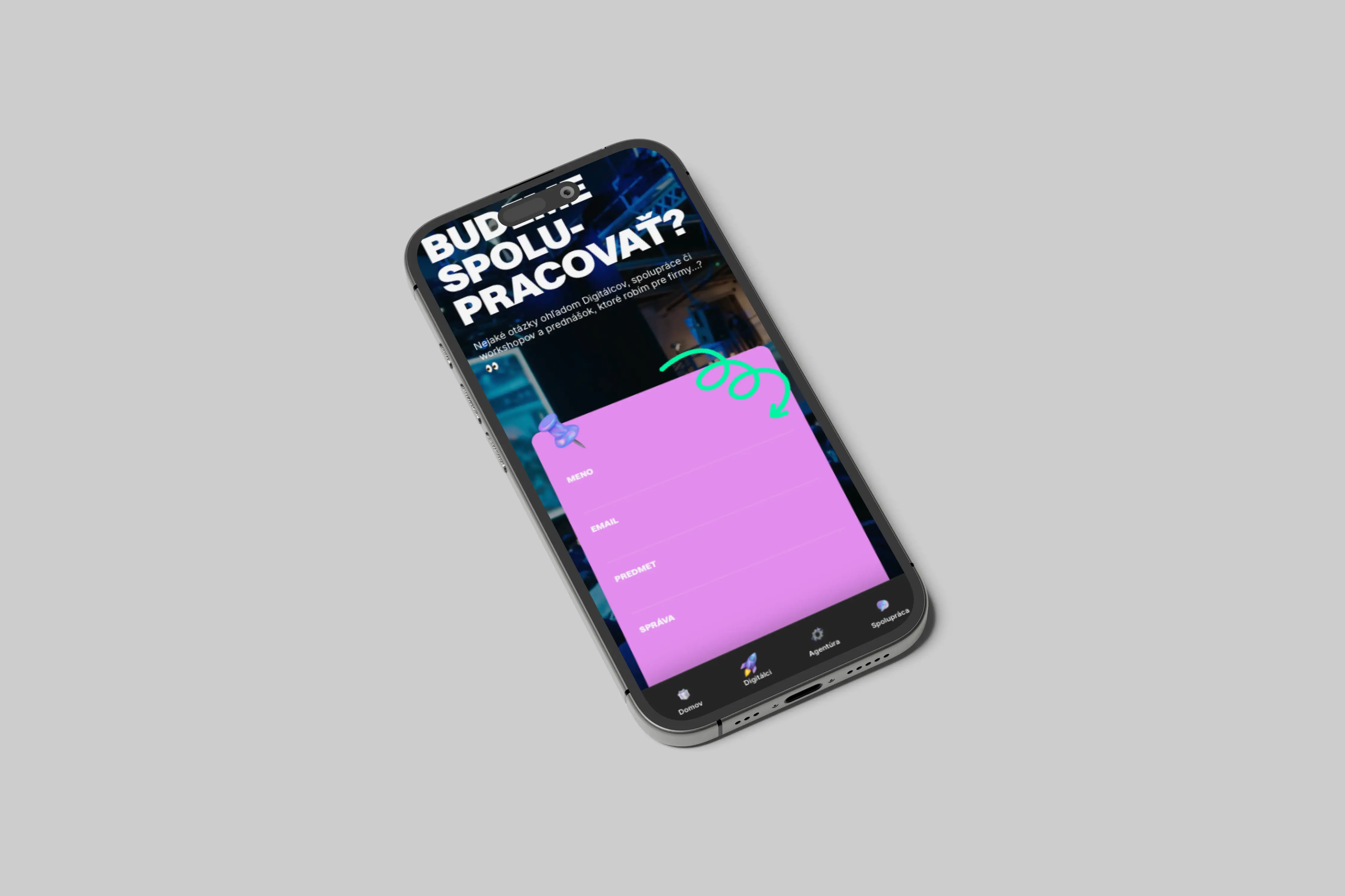
The biggest challenge was to transform a design-wise very expressive concept (bold typography, absolutely positioned decorative elements, ‘street’ style) into a functional UX solution that remains understandable to the user and does not disrupt scanning patterns that visitors are accustomed to. The second challenge was technical: the same visual language had to be reusable across multiple language versions without rebuilding the design for each mutation, which led us to decide to invest in a unified component system instead of faster but less scalable solutions.
(USER CENTRIC)
Despite the bold, ‘loud’ design, we ensured during the UX phase in Figma that visitors could quickly scan the website and find their way to clear actions, primarily signing up for training or joining the Digitálci community. A significant portion of traffic comes directly from social media on mobile, so loading speed was a part of UX as well as a part of the brand.
Selected projects
(project)
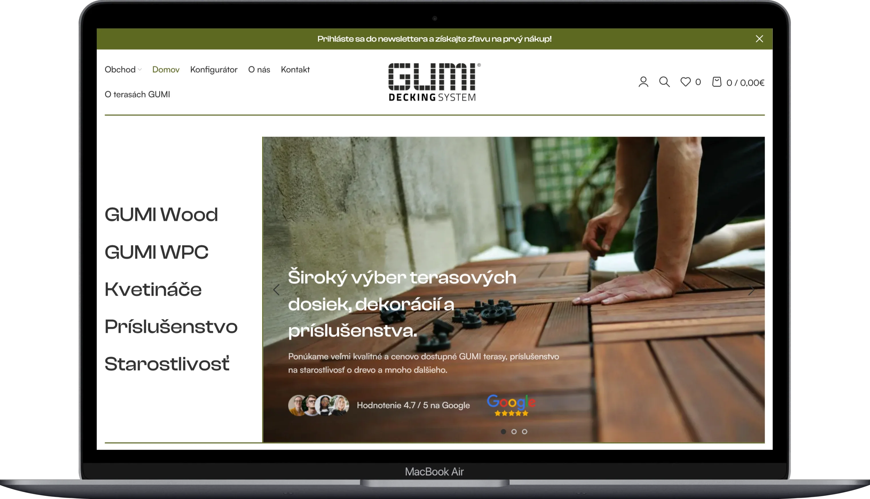
GUMIDECK - Eshop
Category
E-commerce
Client
GUMIDECK
Duration
2 weeks
(project)
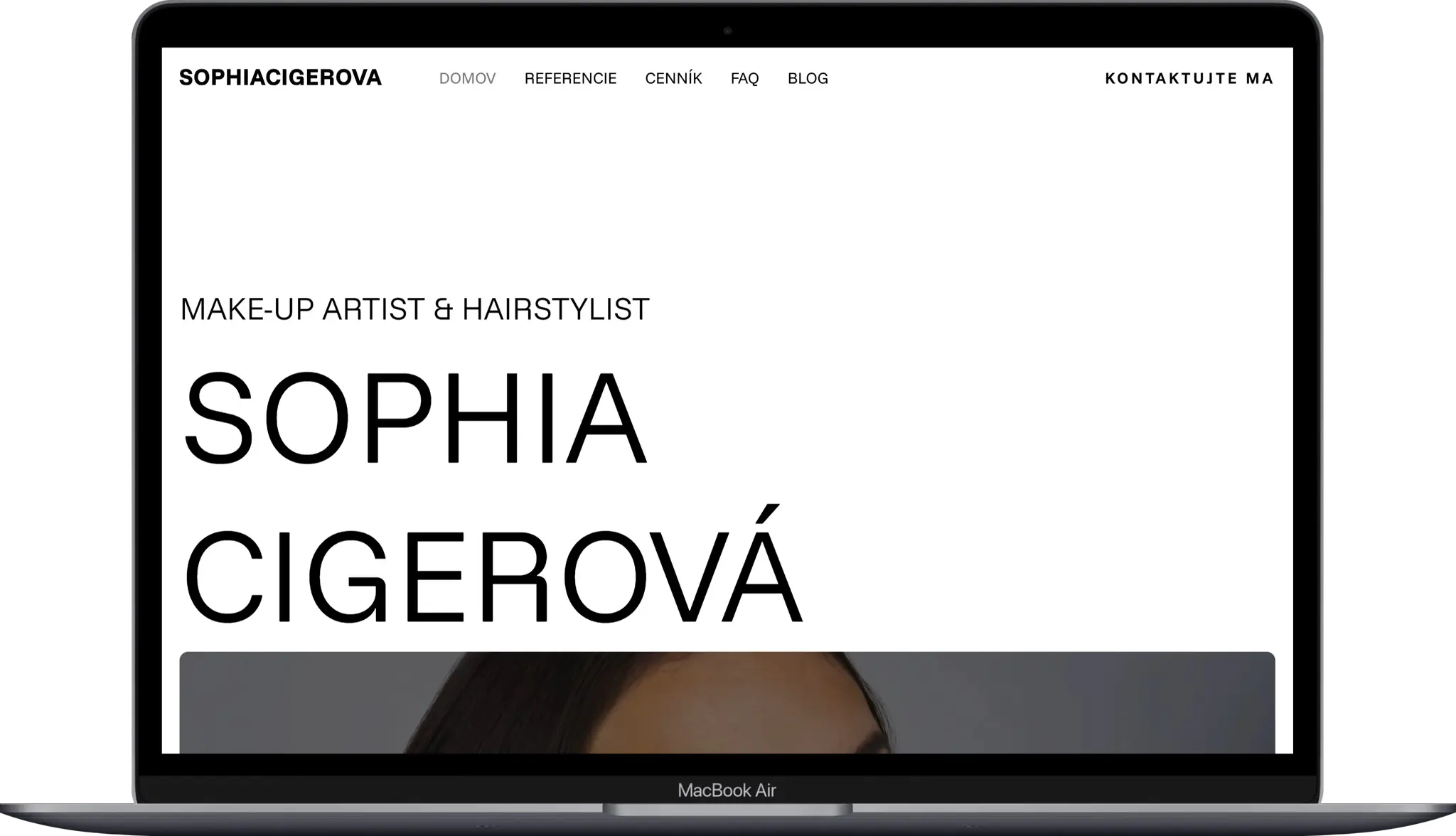
Sophia Cigerova
Category
Website Creation
Client
Sophia Cígerová
Duration
1 week
(project)
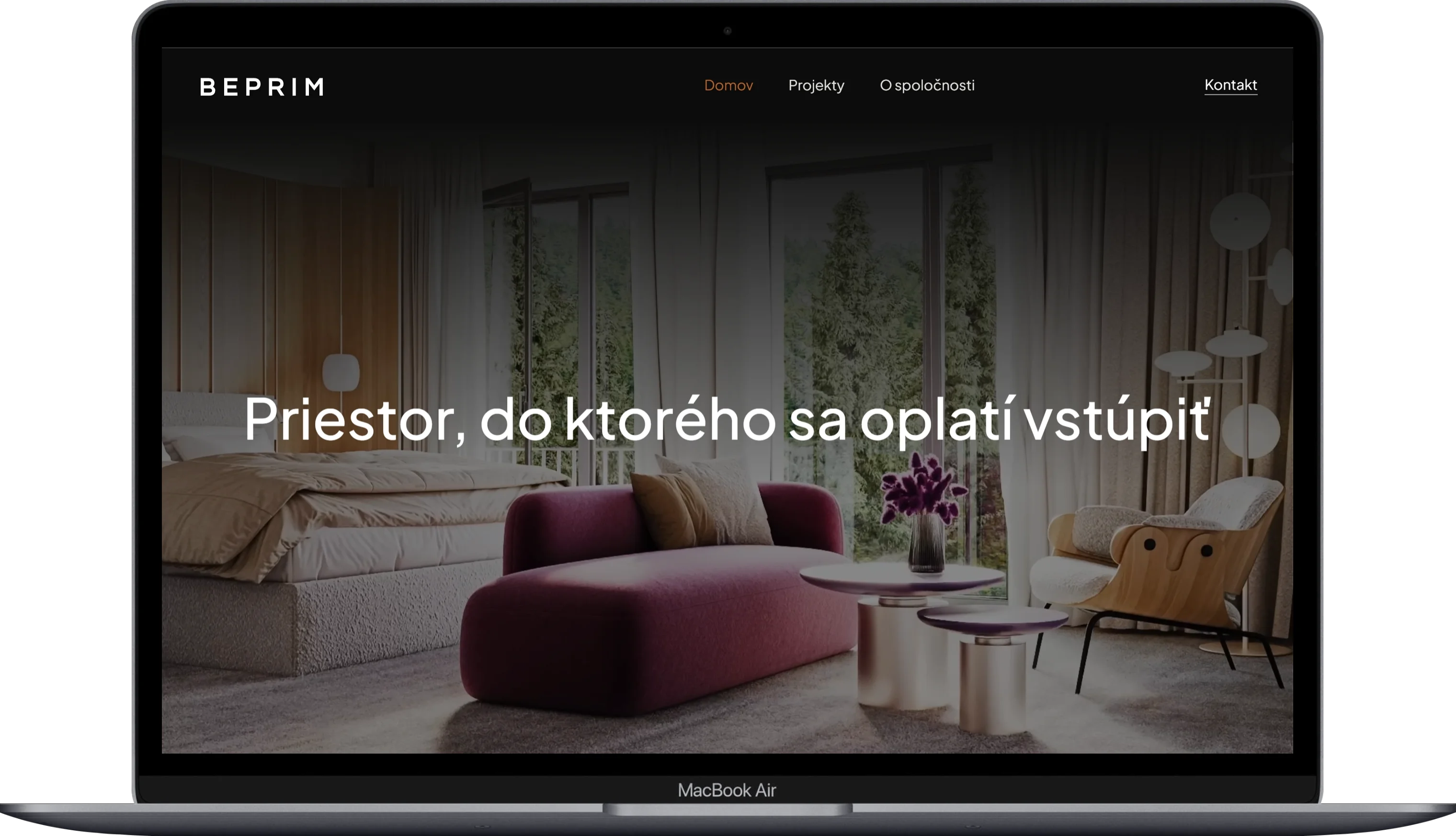
BE-PRIM
Category
Website Creation
Client
BE-PRIM
Duration
1 week
(project)
Harbor Equity
Category
Website Creation
Client
Harbor Equity a.s.
Duration
2 weeks
