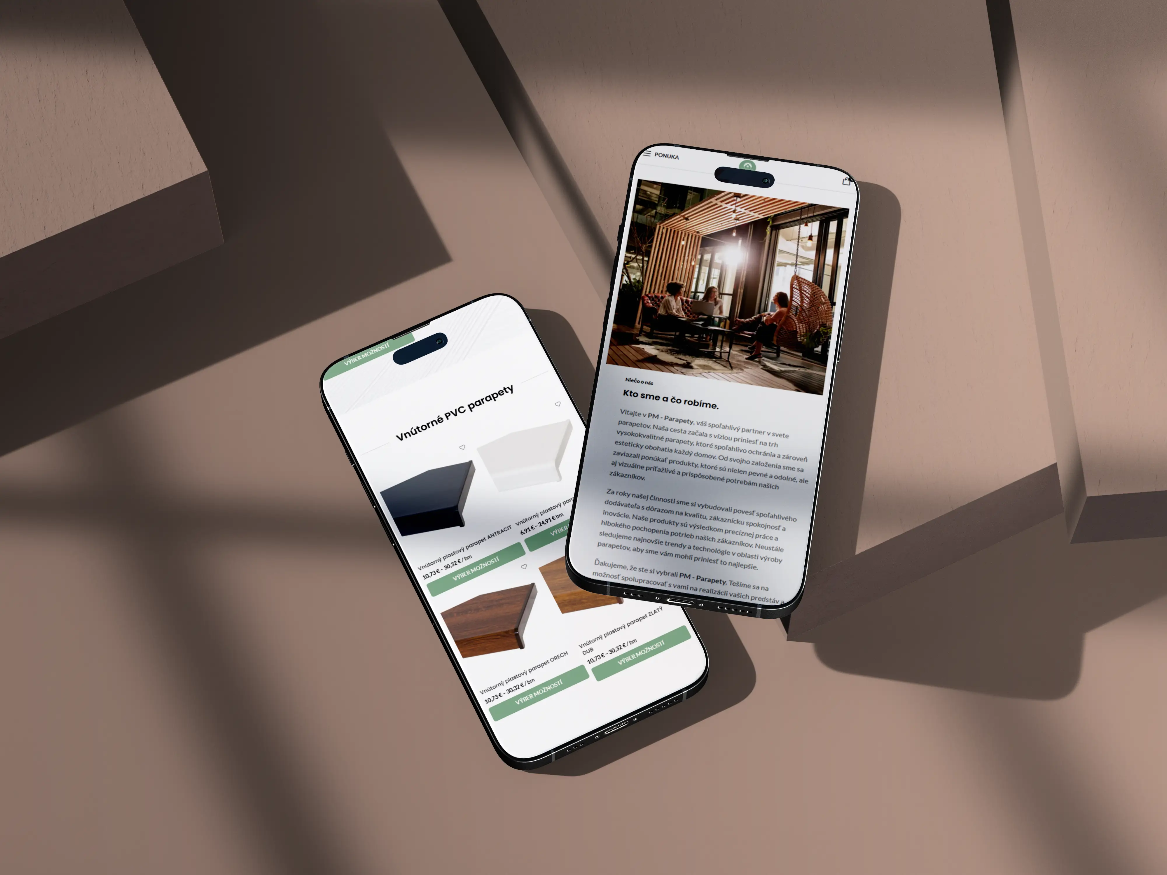
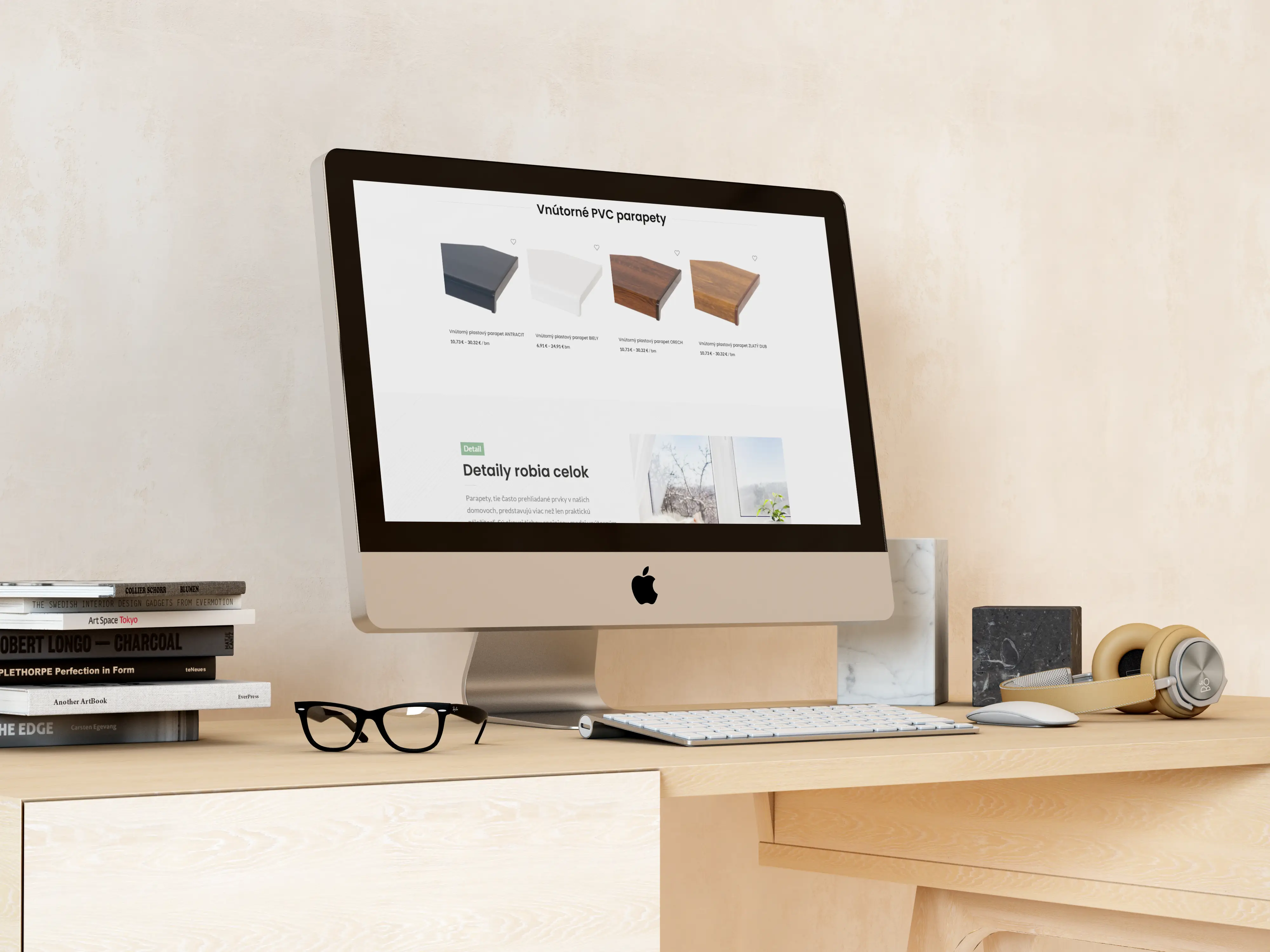
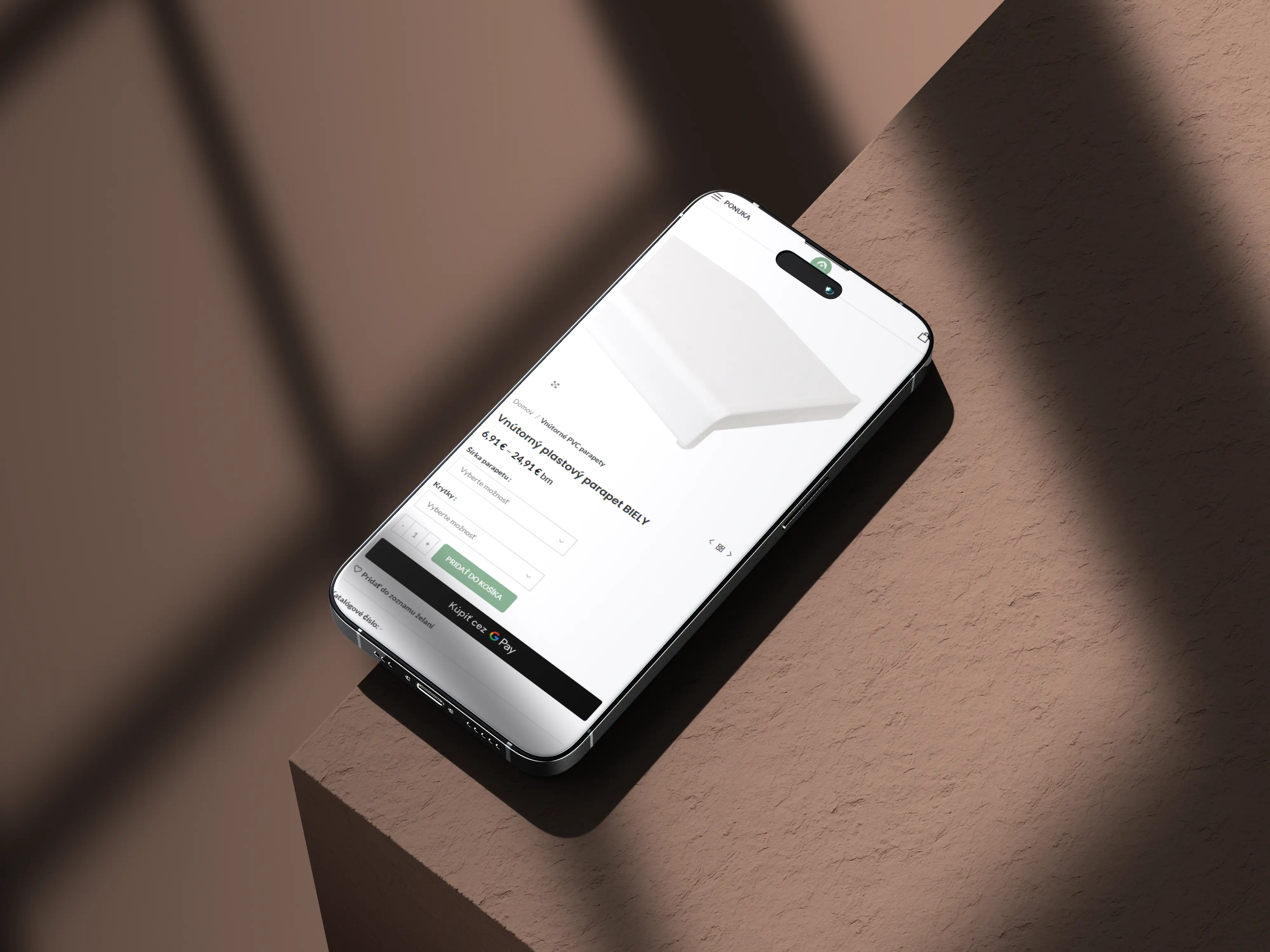
ParapetyNaOkno - Eshop
Kategoria
E-commerce
Klient
PM - Parapety
Realizácia
4 weeks

For Parapetynaokno.sk, we created a presentation website focused on selling interior and exterior window sills for family houses, apartments, and new constructions. Through copywriting and visual design, we transformed this technical construction element into a product that customers perceive as an important part of their home’s interior and exterior. The website is structured to generate inquiries, collect contacts through a newsletter, and is prepared for future expansion into a fully functional e-shop or inquiry system with calculations.
(VÍZIA)
The vision was to create a website that changes the way people perceive window sills. Most customers think about the window sill only at the end of construction or renovation, viewing it as the last technical detail. The website aimed to demonstrate that a well-chosen window sill is a visible part of a home’s design. A place for flowers, books, or a laptop with a view. A functional element that protects the building. And an aesthetic detail that elevates the interior or facade.
(PROBLÉM)
Websites selling construction accessories often share the same issue. They look like technical catalogs filled with parameters that an average customer does not understand and that do not motivate them to purchase. With window sills, this is even more pronounced, as most competing websites display window sills as isolated products without context. A white window sill on a white background. Our approach was to showcase window sills in a real environment, on a window with a view, with flowers, in a modern interior. Customers do not just see a product; they see the outcome of what their window will look like.
(NÁŠ POSTUP)
We built the entire website on one idea: a window sill is not just a technical element, it is a detail that completes the whole. We reflected this principle in the structure, texts, and visuals. We divided the offerings into two clear categories: exterior aluminum window sills that protect the building from rain and dirt, and interior PVC window sills with an emphasis on aesthetics and coordination with the interior. Each category has its own section with technical parameters and visuals showing the window sills in a real environment. To collect contacts, we implemented a newsletter section with information on discounts and news, which builds a customer database for future campaigns.
(POTREBY UŽÍVATEĽA)
A homeowner in construction needs to know which window sills to choose for the exterior facade and why aluminum is preferable. An apartment owner undergoing renovation is looking for interior window sills that will align with the new windows and flooring. An interior designer needs an overview of available styles and colors. For each of them, the website offers relevant information at the moment they need it. The division into exterior and interior allows for quick orientation, and the newsletter with discount information ensures that even a customer who decides later stays in touch with the brand.
(VÝZVY)
The main challenge was to sell a product that most people do not actively consider. Window sills are not a product that customers seek out on their own initiative. They typically focus on windows, facades, or interiors, and the window sill is a secondary item. The website had to bring this product to the forefront and showcase its value independently. Copywriting was key; from technical specifications (aluminum, PVC, durability, maintenance), we crafted a narrative about a detail that creates the atmosphere of a home. At the same time, we designed the website with future expansion into a product catalog and inquiry system in mind, so that a complete overhaul would not be necessary.
(USER CENTRIC)
The website is designed for individuals who are currently dealing with construction or renovation and need to select window sills. They often lack experience in selection, are unsure of which material to choose, and are unaware of the differences between aluminum and PVC window sills. Therefore, the page is structured simply. First, a decision on interior or exterior. Then a clear explanation of the materials and their benefits without technical jargon. And finally, a clear path to contact or inquiry. The entire process is designed so that the customer can make a decision in one visit, not after three.
Selected projects
(PROJECT)
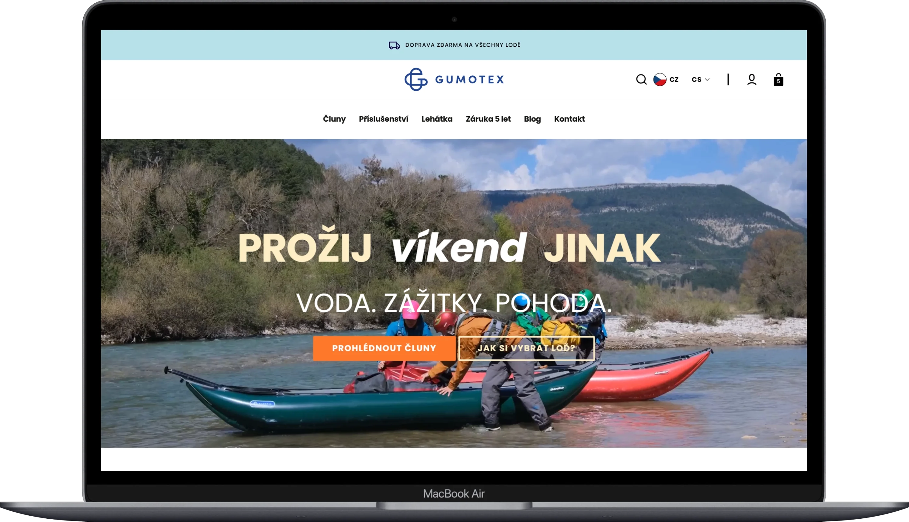
Gumotex
Kategoria
E-commerce
Klient
GUMOTEX Coating s.r.o.
Trvanie
3 months
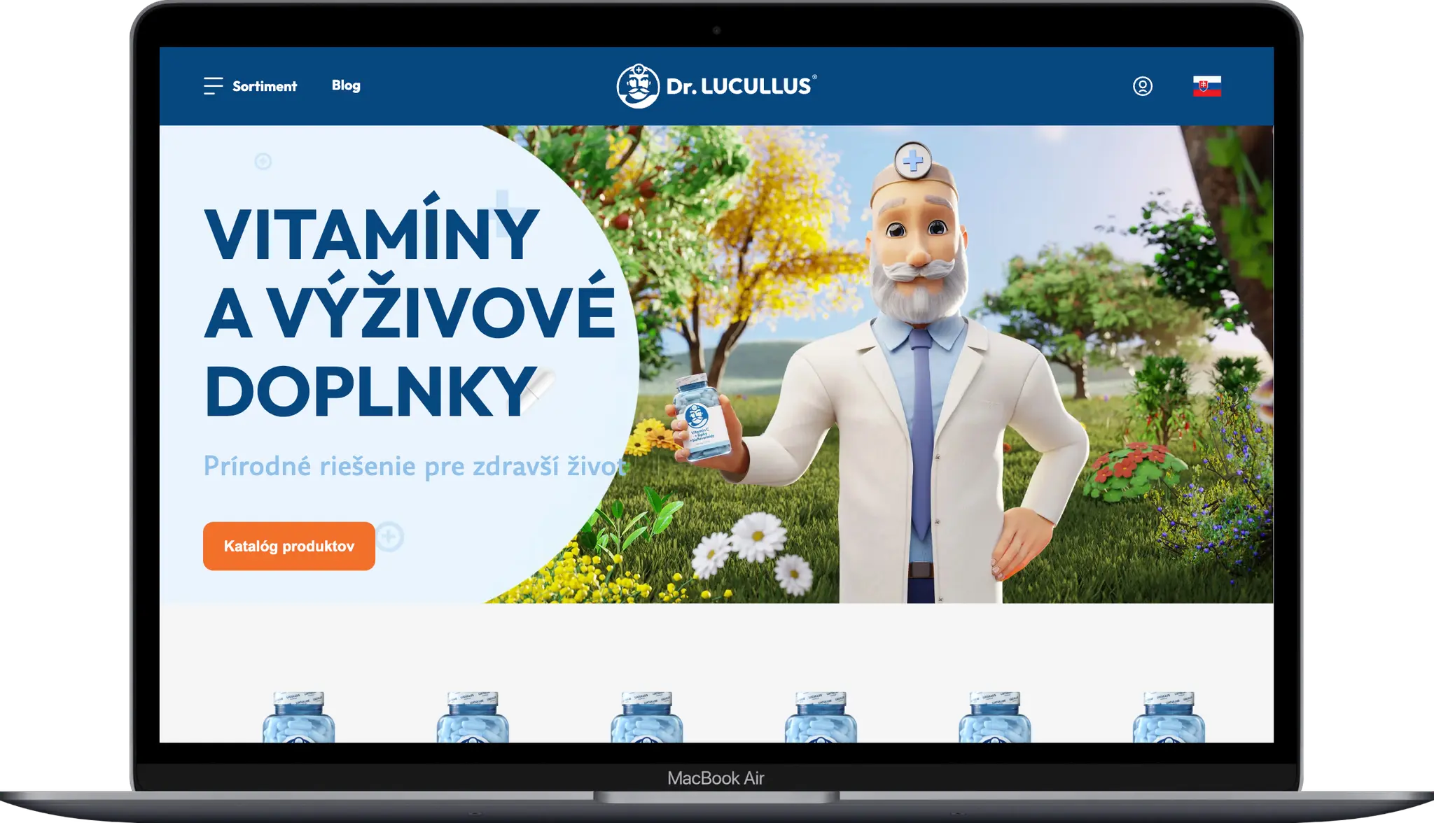
(PROJECT)
Dr. LUCULLUS
Kategoria
Custom Development
Klient
Dr. Lucullus MEDICAL
Trvanie
March 1, 2025 - present
(PROJECT)
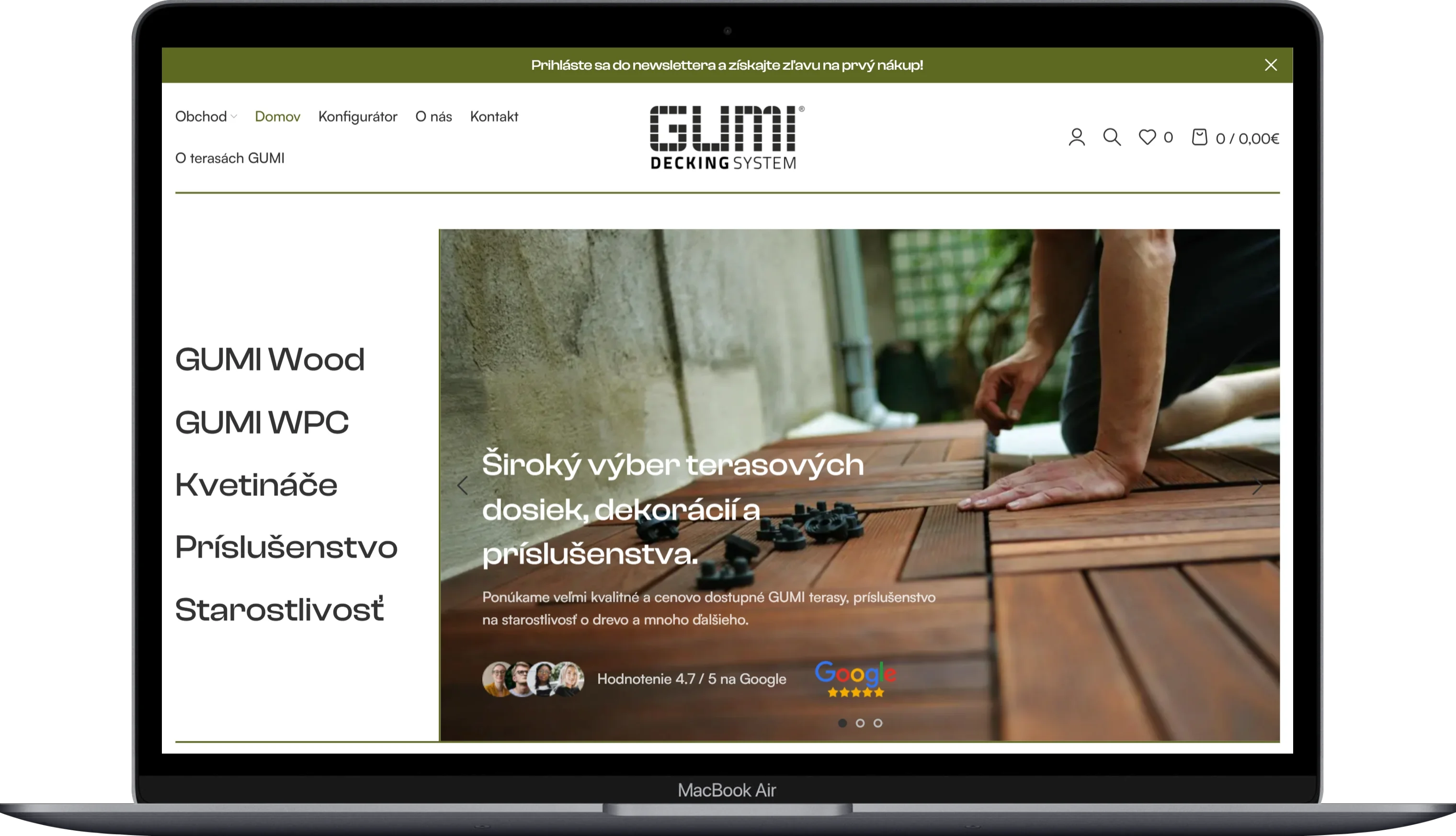
GUMIDECK - Eshop
Kategoria
E-commerce
Klient
GUMIDECK
Trvanie
2 weeks
(PROJECT)
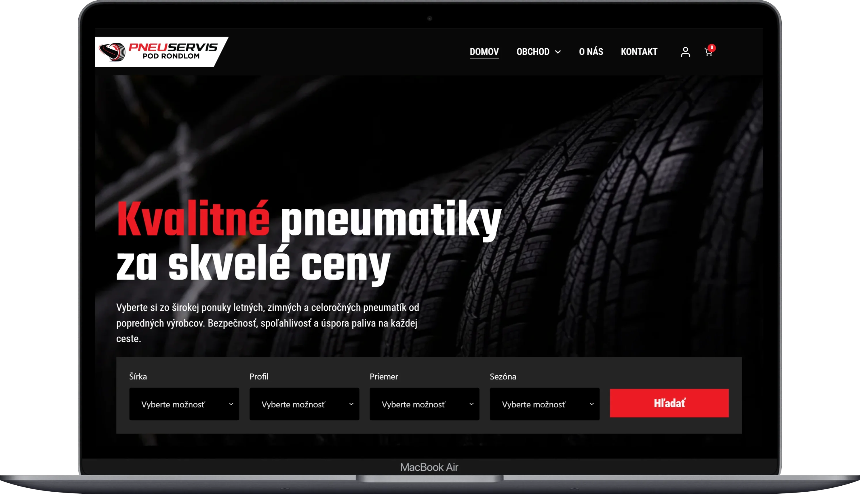
Pneugrup - e-shop
Kategoria
E-commerce
Klient
Pneuservis pod rondlom
Trvanie
2 months