ToTheMoon Studio
Kategoria
Website Creation
Klient
ToTheMoon Studio
Realizácia
4 weeks
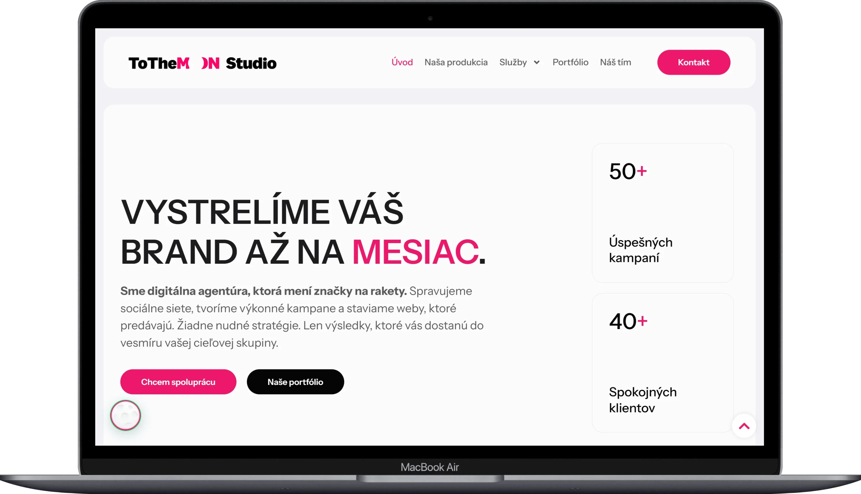
For ToTheMoon Studio, we designed and developed a presentation website that communicates the story and values of a Slovak digital agency focused on performance marketing, social media management, and online advertising. From needs analysis to wireframes and prototypes, and finally implementation in WordPress, we created a website that visually sets the brand apart from its competitors and helps it acquire new clients.
(VÍZIA)
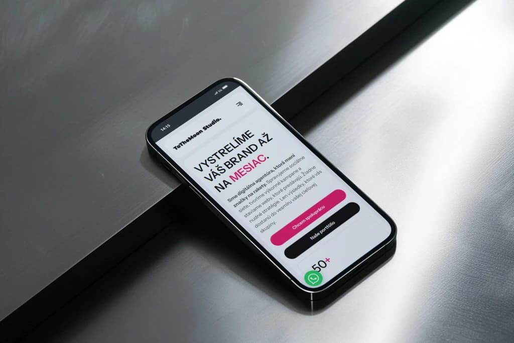
The vision of the project was to create a website that reflects the values of minimalism, elegance, and functionality. Inspired by Apple's approach to design, the result remains a unique imprint of the ToTheMoon Studio brand. The website was intended to appear professional and premium, just as the agency approaches its work with clients.
(PROBLÉM)
Presentation websites of digital agencies often fall into two extremes. They are either overwhelmed with information and portfolio or so minimalist that visitors are left wondering what the company actually does. The challenge was to find a balance between visual appeal and informational value. Every element on the page had to have a clear purpose while contributing to the overall aesthetic of the website.
(NÁŠ POSTUP)
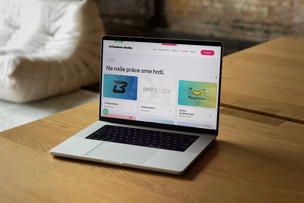
We started the project with a detailed analysis of the client's needs and mapping the target audience. Based on our findings, we created wireframes and interactive prototypes with an emphasis on user experience. In the visual phase, we combined the principles of the Apple design system with the identity of ToTheMoon Studio, resulting in a clean and confident visual language. The final form was implemented in WordPress in combination with Elementor, allowing the client to easily manage and update content without developer intervention.
(POTREBY UŽÍVATEĽA)
Visitors to the ToTheMoon Studio website arrive with a simple question: Is this the agency I can trust with my marketing? They need to quickly find out who stands behind the brand, what projects they have handled, and how to contact them. Therefore, we prioritized clear communication of brand values, an organized portfolio display, and an easy pathway to contact. The entire site is designed to answer this question in just a few seconds.
(VÝZVY)
The biggest challenge was to combine two worlds that often contradict each other: the robustness of WordPress as a CMS and the visual clarity inspired by Apple principles. WordPress offers flexibility in content management, but achieving pixel-perfect design with smooth animations and consistent behavior across devices required meticulous work with Elementor and custom code adjustments.
(USER CENTRIC)
The website was designed with a strong focus on intuitiveness and clarity. The information structure is thoughtfully arranged so that the visitor doesn't have to think about where to click. Simple navigation elements and elegant animations guide the user naturally through the content of the page. No unnecessary steps, no distractions. Just a smooth transition from the first impression to understanding the brand.

Selected projects
(PROJECT)
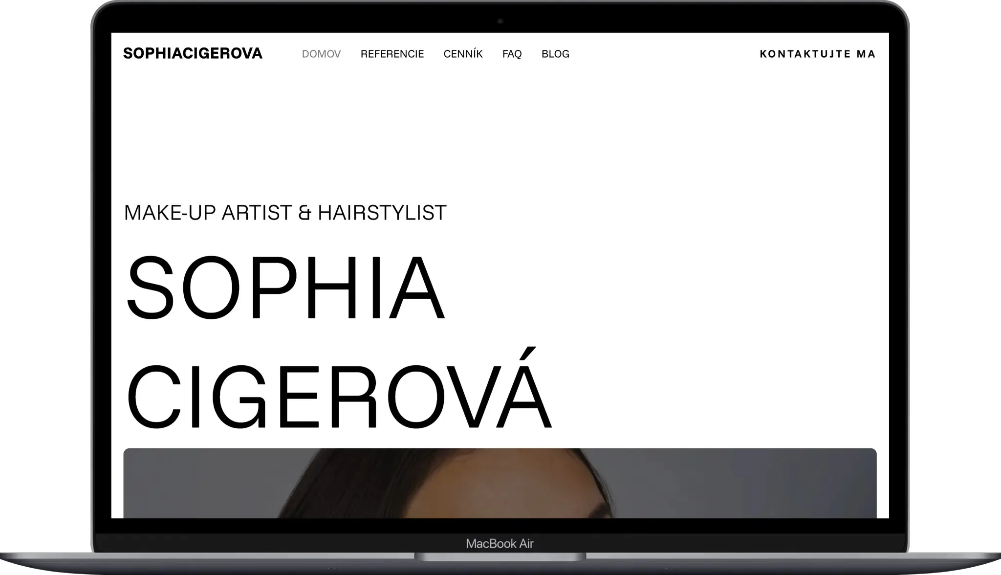
Sophia Cigerova
Kategoria
Website Creation
Klient
Sophia Cígerová
Trvanie
1 week
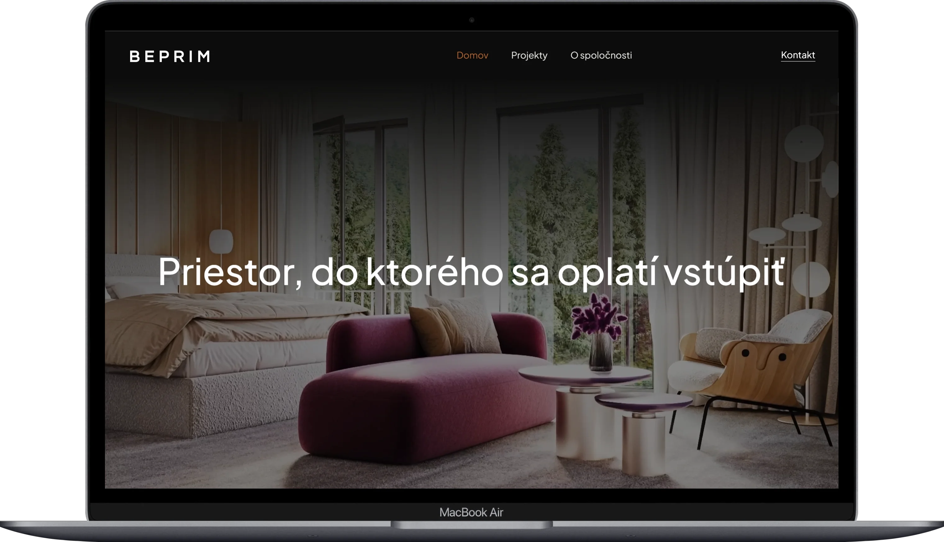
(PROJECT)
BE-PRIM
Kategoria
Website Creation
Klient
BE-PRIM
Trvanie
1 week
(PROJECT)
Harbor Equity
Kategoria
Website Creation
Klient
Harbor Equity a.s.
Trvanie
2 weeks

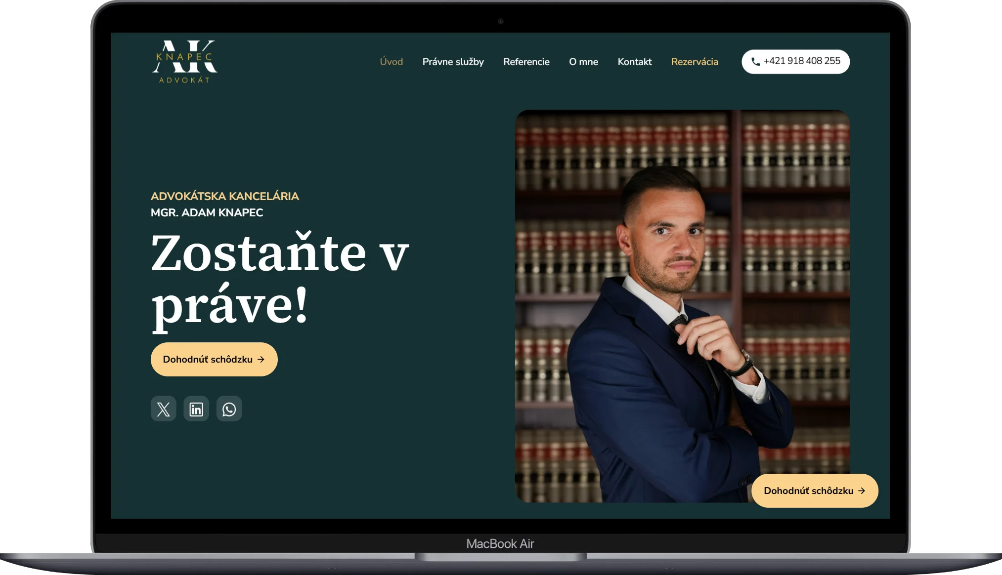
(PROJECT)
Adam Knapec
Kategoria
Website Creation
Klient
Mgr. Adam Knapec
Trvanie
2 weeks