How UX design affects the conversions of your online store

UX design determines whether a customer will make a purchase or leave for a competitor. Discover how specific elements of the user experience influence conversions, cart abandonment, and the overall profitability of your online store.
How UX design affects the conversions of your e-shop
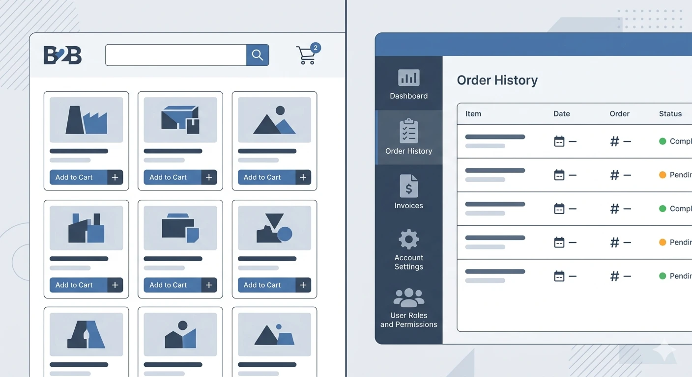
The customer opens your e-shop on mobile. They see the product they were looking for. They want to buy it. But the "Add to Cart" button is hidden under a photo that did not display correctly on their screen. They try to scroll, but the navigation does not respond as they expected. After ten seconds of frustration, they close the page and open a competing e-shop.
This entire story unfolds without a single contact with your customer support, without a single complaint. Just a silent exit. And this is exactly what the reality of e-shops that underestimate UX design looks like.
What is UX design and why does it matter
Many e-shop owners picture UX design as colors, fonts, and a "nice visual." In reality, it is something much more complex. According to Interaction Design Foundation, UX design is the process of designing products and services to be meaningful, useful, and pleasant to use. It encompasses not only what the customer sees on the screen but the entire journey from the first contact with the e-shop to the moment they hold the product in their hands.
In the context of e-commerce, this means that UX design covers every point of interaction. From how quickly the page loads, through how intuitive the menu layout is, to how easy the payment process is. As experts from UserTesting emphasize, UX is not just about the interface, but about the feeling a person gets from the interaction. And that feeling is what determines whether a visitor becomes a customer.

source: https://online.hbs.edu/blog/post/customer-journey-map
Hard numbers: UX design is not a luxury, it is a business tool
Talking about the importance of user experience without specific data would be like selling a product without a price tag. So let's turn to the numbers.
According to an analysis published on AB Digital, an intuitively designed interface can increase conversion rates by up to 200% or more. That is not a typo. A well-thought-out user experience can triple the number of customers who complete their purchase without you having to spend a single cent more on advertising.
On the other hand, there are alarming statistics. Research cited by Belov Digital shows that 88% of users simply do not return to a website after a bad experience. And 76% of people claim that the most important feature of any site is its simplicity and ease of navigation. These numbers clearly show that a responsive website and quality UX design are not separate disciplines but two sides of the same coin.
Microstress: the invisible killer of conversions
There is a phenomenon that is surprisingly rarely discussed in the world of e-commerce, yet its impact is significant. It is called microstress, sometimes referred to as cognitive fatigue. Research published on the platform Zenodo confirms that even seemingly minor frictions in the purchasing process have a cumulative effect on the customer’s decision-making.
What does this entail? A button that is a few pixels off from the expected position. A field in a form that requires data but does not explain in what format. A category name that is not entirely clear. Each of these little details alone does not cause a customer to leave. But their combination creates a sense of complication, and it is this feeling, not the actual length of the process, that leads to cart abandonment.
Interestingly, one unclear step in the checkout process can have a larger negative impact on conversion than a complete redesign of the homepage. People prefer to delay their decision rather than continue with something they do not fully understand. For your e-shop, this means that investing in simplicity and clarity is often more effective than investing in visual appeal.
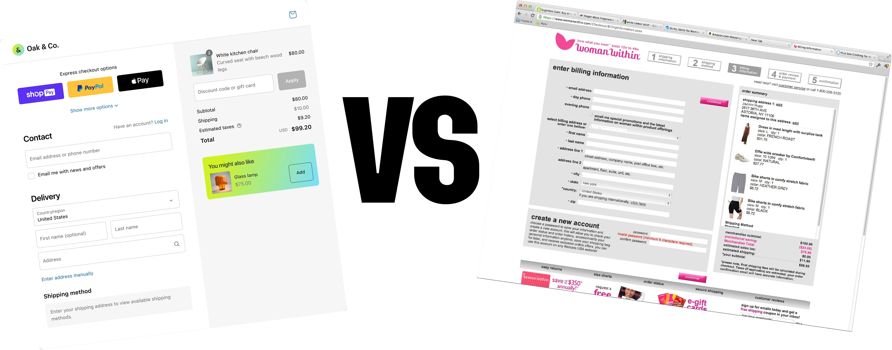
Shopify understands this exactly, considering the checkout process as the most important part of the entire e-shop. Not the homepage, not the product page, but that last step where the customer decides whether to complete the purchase. They have invested years of development and testing into their checkout process with a single goal: minimizing the number of steps, auto-filling information, and removing anything that could distract or frustrate the customer. Shopify openly states that every extra second in checkout means lost conversions. And if this holds true for the largest e-commerce platform in the world, it holds true for your e-shop as well.
Psychological microsignals of trust
When a customer considers whether to buy from your e-shop, their brain subconsciously processes dozens of signals that either build or undermine trust. According to an analysis on MoldStud, small elements of trust, such as visible reviews, recognizable payment gateway logos, clearly communicated return policies, and a consistent visual style significantly reduce purchase anxieties.
What is particularly interesting is that a consistent visual and unified language throughout the website significantly enhances perceived trustworthiness more than standalone "trust badges" or certificates. In other words, if you have five security stamps on the page, but the rest of the website appears chaotic and unprofessional, those stamps won't help you. This is because the customer does not perceive individual elements in isolation. They perceive the whole. And a broken visual impression can devalue even the best guarantees.
This is especially important for e-shops in the Slovak market. The Slovak customer is cautious and often compares several stores before making a decision. An e-shop that presents a coherent and professional impression has a distinct advantage over competitors who may offer the same products but present them in an inconsistent environment.
UX after the purchase: what Google Analytics often does not see
Most e-shops focus their attention on the customer journey from the moment they arrive on the page to the click on "Order." But UX design does not end at the moment of payment. Quite the opposite. What happens after the purchase determines whether the customer returns and whether your e-shop will be recommended further.
As noted by Alex Krleski on LinkedIn, companies that address user experience from start to finish (end to end) report a higher number of repeat purchases and better retention metrics. This ultimately reflects in a higher customer lifetime value (LTV).
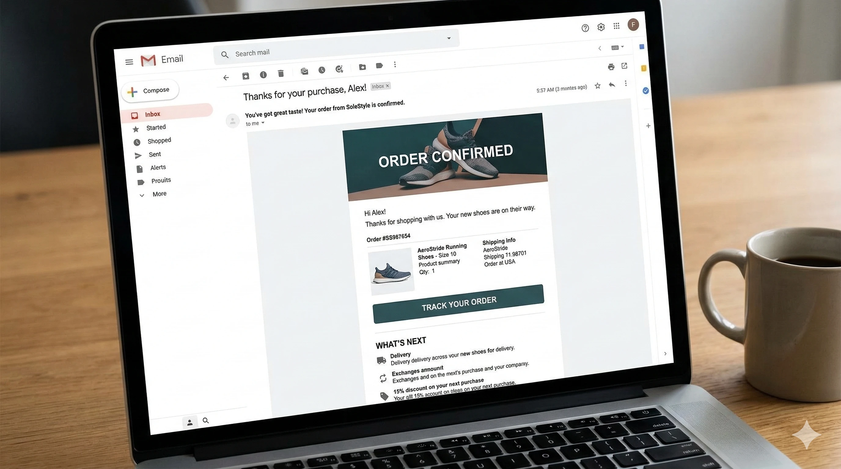
What exactly are we talking about? About a clear order confirmation where the customer immediately sees what they purchased, when it will arrive, and how much they paid. About understandable emails that inform about the status of the shipment without unnecessary marketing noise. About a simple complaint process where the customer does not have to search for a contact form through three levels of a menu.
Brands like Zara or Nike exemplify how a combination of personalized recommendations, intuitive navigation, and thoughtful post-purchase flow leads to higher retention and conversions. These principles are not reserved solely for global corporations. Even a Slovak e-shop with dozens of products can implement them and gain measurable competitive advantage.
Personalization as UX, not as a technological gimmick
The last aspect that fundamentally influences conversions is personalization. But not personalization in the sense of "we have AI, so let's deploy it somewhere," but personalization as a thoughtful layer of user experience. According to AB Digital, personalized interactions and recommendations significantly increase engagement and conversions.
The key is how, where, and when you display these recommendations. If you offer the customer a relevant bag or mouse in a clear block with a clear hierarchy after they add a laptop to their cart, they perceive it as a useful service. However, if you overwhelm them with ten randomly generated products scattered across the entire page, they perceive it as interference.
Thus, the algorithm alone is not enough. The way recommendations are integrated into the overall UX design of the e-shop is what matters. The right hierarchy, relevant context, and appropriate placement turn personalization into a powerful tool. Without these elements, it is just another source of visual noise.
Conclusion: UX design is the most profitable investment for your e-shop
If you take away only one idea from this article, let it be this: UX design is not a "nice to have" item in the budget. It is a directly measurable business factor that influences conversions, retention, customer trust, and ultimately the overall profitability of the e-shop.
A responsive website ensures that the customer reaches you. Quality UX design ensures that they also make a purchase. And a thoughtful post-purchase experience ensures that they return. Each of these steps is an investment that demonstrably pays off. The question is not whether your e-shop can afford it. The question is whether it can afford to ignore it.
Selected projects
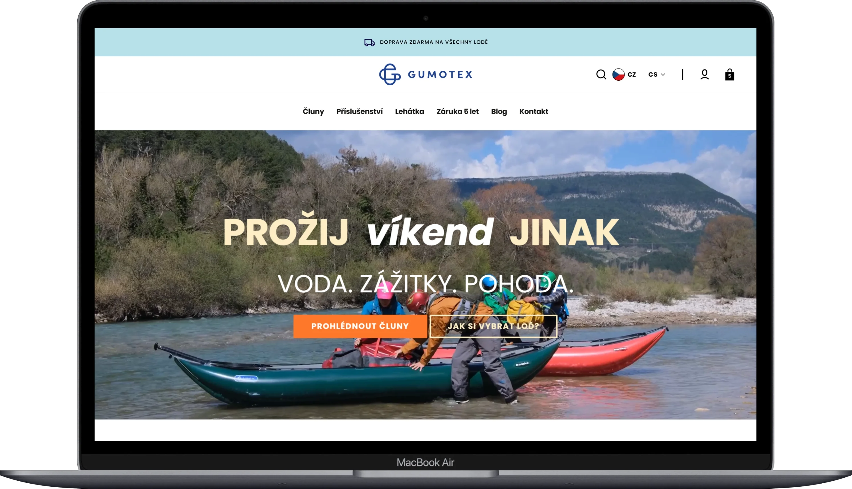
Gumotex
Category
E-commerce
Client
GUMOTEX Coating s.r.o.
Duration
3 months
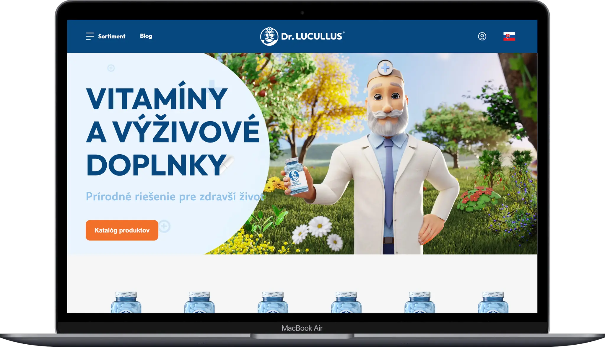
Dr. LUCULLUS
Category
Custom Development
Client
Dr. Lucullus MEDICAL
Duration
March 1, 2025 - present
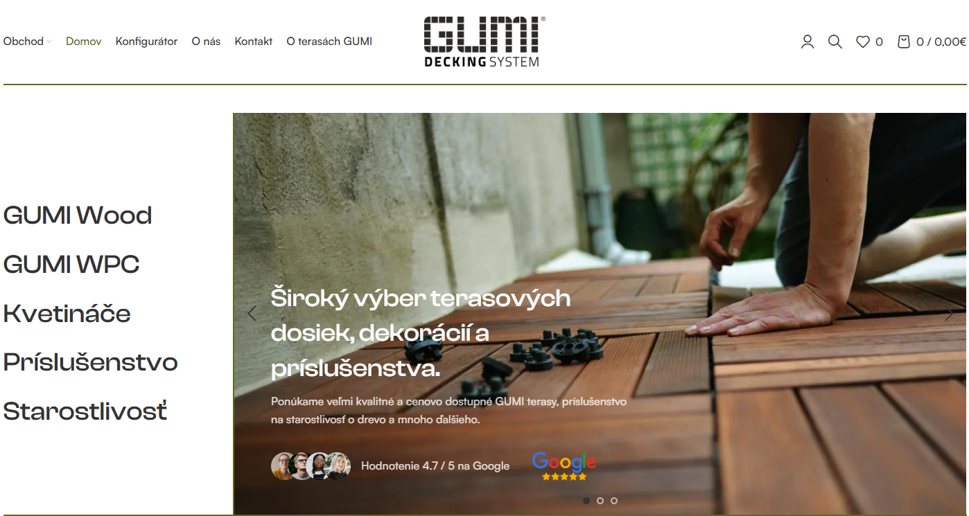
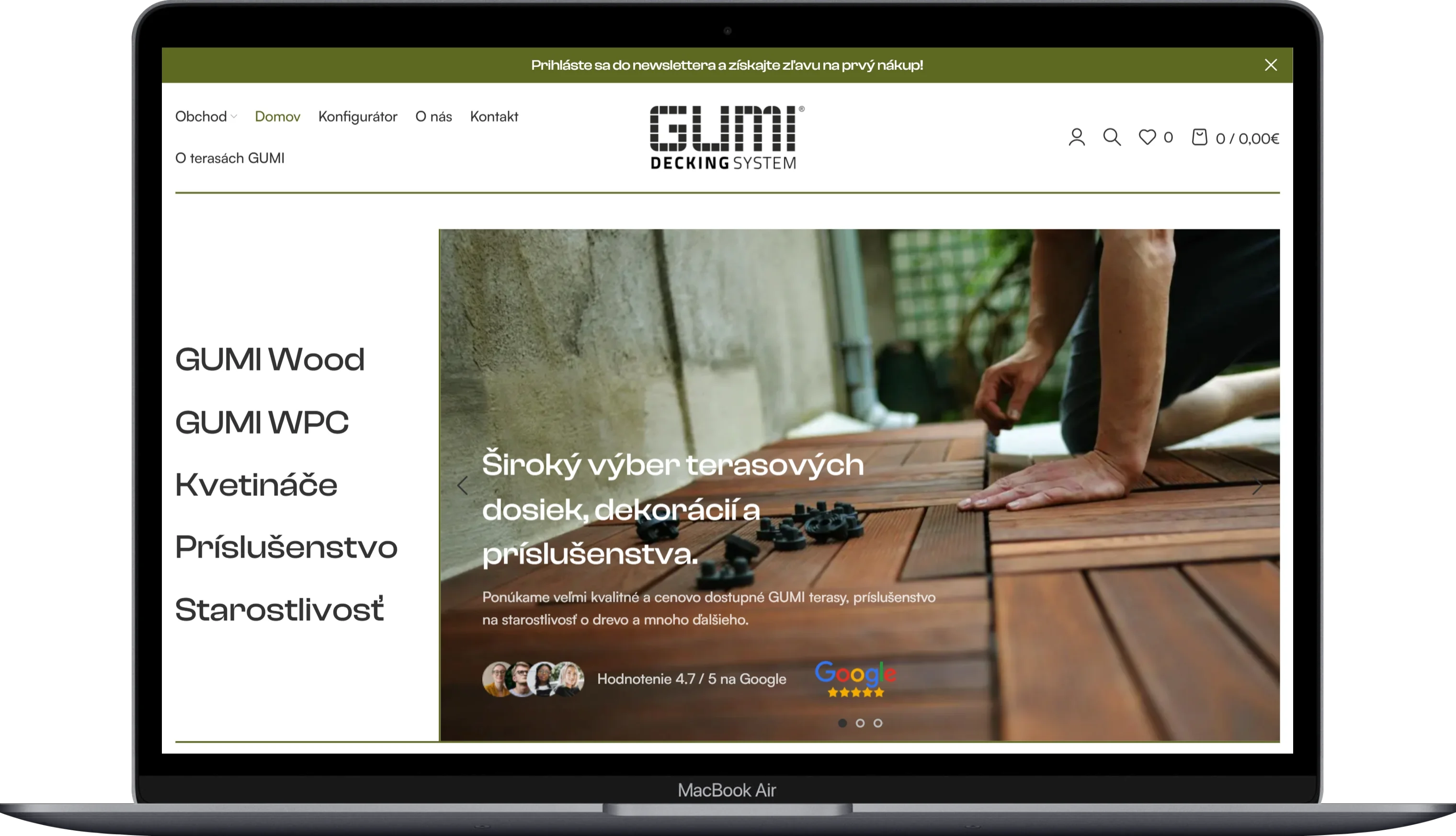
GUMIDECK - Eshop
Category
E-commerce
Client
GUMIDECK
Duration
2 weeks
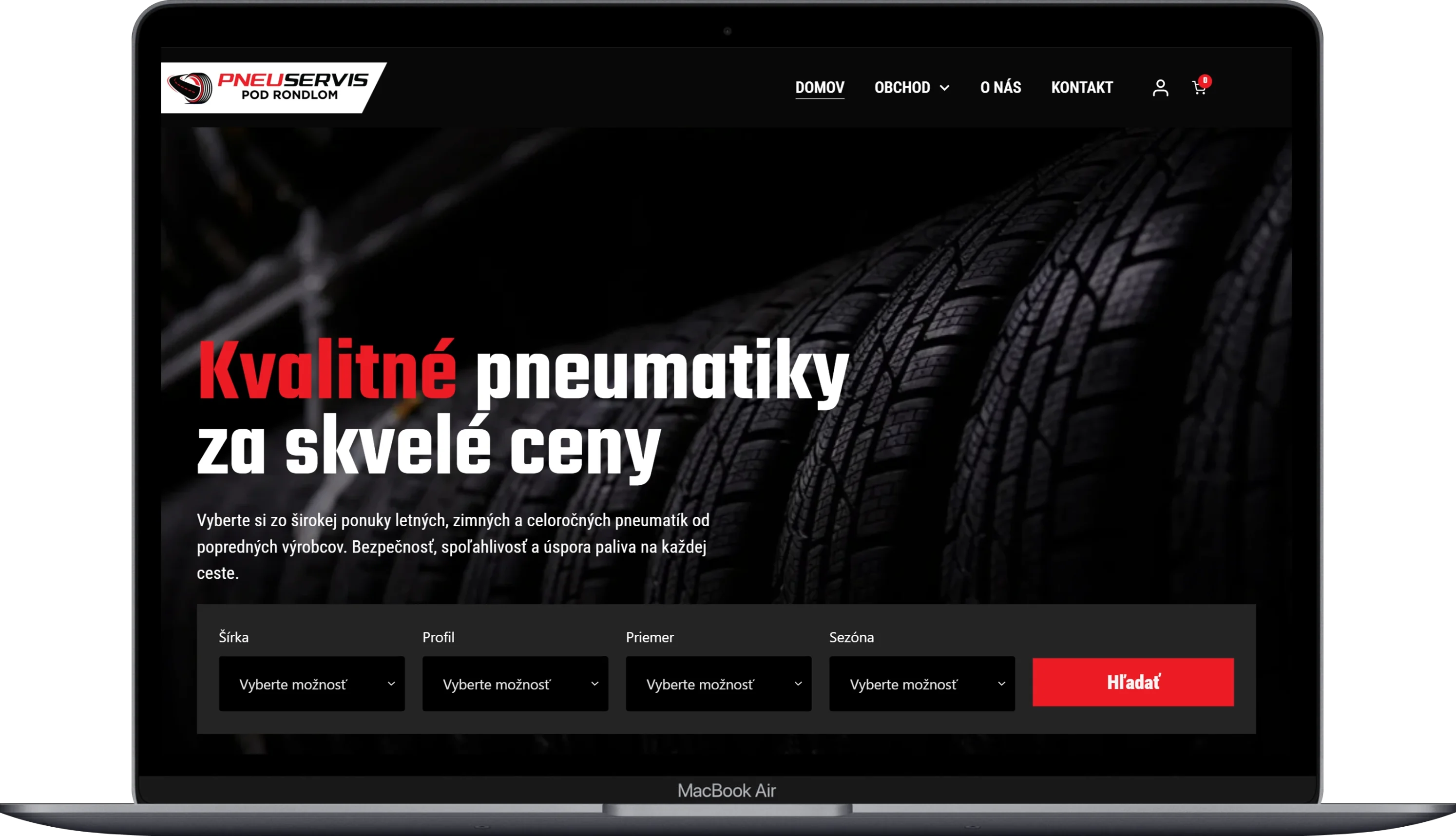
Pneugrup - e-shop
Category
E-commerce
Client
Pneuservis pod rondlom
Duration
2 months