Why Every E-Shop Needs a Responsive Website

Mobile devices generate the majority of e-commerce sales. Find out why a responsive website is essential for your e-shop and how it affects conversions, SEO, and customer trust.
Why Every E-shop Needs a Responsive Website
Imagine a situation. A customer is sitting on a train, holding a phone in their hand, and looking for a product that you just presented to them through an advertisement. They click on a link, the page loads, but the text is tiny, the buttons are impossible to tap with a finger, and the whole layout looks as if it was designed exclusively for a monitor. What will they do? They will leave. And probably forever. This is the reality that thousands of e-shops face daily.
A responsive website is not a luxury or an additional feature. It is a fundamental necessity without which a modern e-shop simply cannot function.
Mobile Traffic is the New Standard
The days when people shopped exclusively from computers are long gone. According to the analysis by Alexander Jarvis, mobile devices generate 56% of all e-commerce sales globally. This trend is not bypassing Slovakia, where e-commerce revenues in 2025 are projected to reach approximately $2.56 billion, with a significant portion coming from the mobile segment.
These numbers speak for themselves. If your e-shop is not optimized for mobile devices, you are ignoring the majority of potential customers. A responsive website ensures that your page automatically adapts to any screen size, from smartphones to tablets and desktop monitors. As a result, customers receive the same quality experience regardless of where they are shopping.
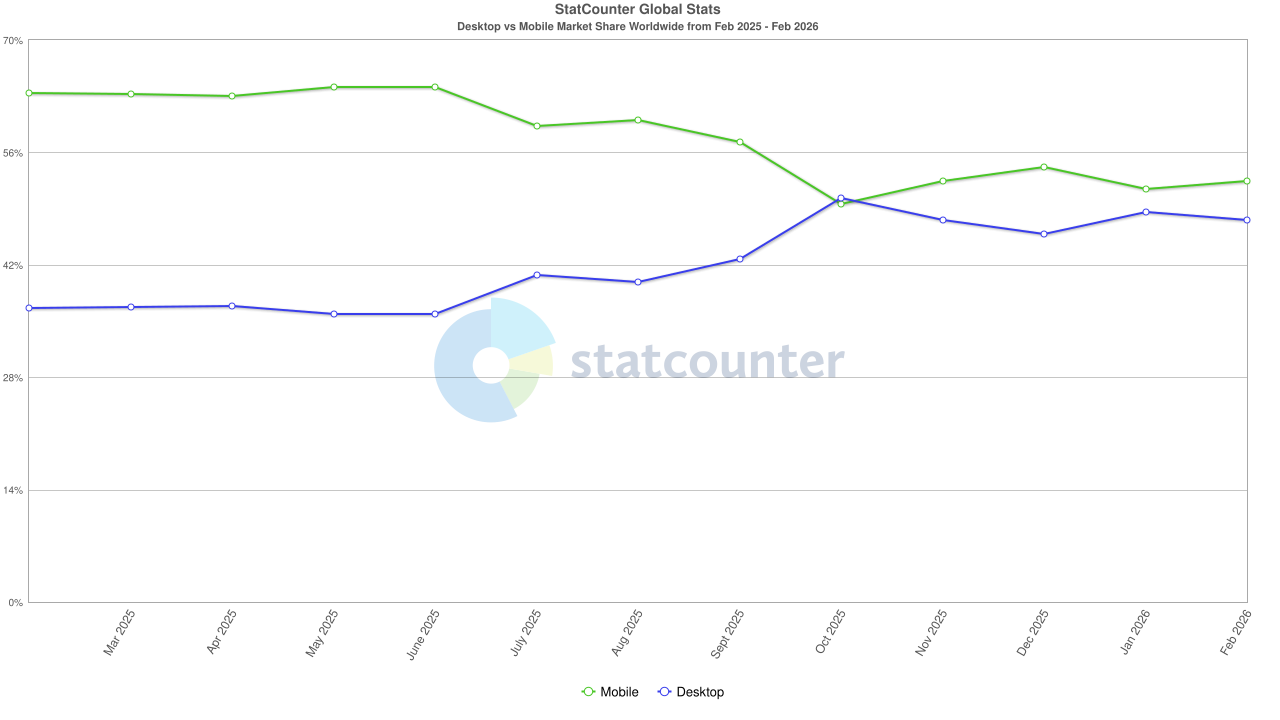
source: https://gs.statcounter.com/platform-market-share/desktop-mobile/worldwide/
Conversions, Bounce Rate, and Real Impact on Revenue
Getting traffic is one thing. Converting it into sales is another. And this is where a responsive website proves to be a key factor. According to data from Midasto.sk, mobile conversions average 1.8%, which is 29% higher compared to desktop, where the average conversion rate is 1.4%. However, this difference applies only to optimized sites.
On the other hand, unoptimized e-shops face dramatic problems with bounce rates. Pages that take longer than 3 seconds to load experience bounce rates of up to 53%. This means that more than half of visitors leave before even seeing the product offerings. Faster loading on mobile, in turn, increases conversions by 20 to 32%, which are numbers no entrepreneur can afford to ignore.
Quality UX design is an integral part of this context. It's not just about how the page looks. It's about making the whole purchasing process intuitive, fast, and free of unnecessary obstacles. When a customer finds a product, adds it to their cart, and completes the order without a moment of frustration, conversion is almost guaranteed. However, if they have to navigate through a confusing menu, zoom in on text, and search for a hidden "Add to Cart" button, they are lost.

Google and Mobile-First Indexing: Responsive Web as an SEO Necessity
Google has been using so-called mobile-first indexing for a few years now. In practice, this means that Google prioritizes the mobile version of websites when evaluating and indexing them. As stated by Uniobchodsystem.sk, non-optimized pages gradually fall in mobile searches and lose visibility for potential customers.
A responsive website also brings another significant SEO advantage. One URL for all devices consolidates what is known as link equity. This means that all backlinks point to a single version of the page, thus increasing its authority in the eyes of search engines. Unlike solutions where a separate mobile domain exists (for example, m.yourshop.sk), a responsive website ensures that the link power is not diluted.
Another factor is Core Web Vitals, metrics that Google uses to assess user experience. A responsive website that loads quickly, is visually stable, and responds to interactions without delay receives better ratings in these metrics, and thereby better positions in search results.
According to an analysis by Dixie Raiz Pacheco, responsive design directly affects SEO performance, as it eliminates issues with duplicate content, simplifies crawling for search engines, and improves the overall technical condition of the website. For e-shops that rely on organic traffic, this is a factor that could determine the success or failure of the entire business.

source: https://blog.aira.cz/sites/default/files/mobile_first_0.png
User Experience Builds Trust
In e-commerce, a simple rule applies: if a customer trusts your e-shop, they will buy. And trust is built through details. A responsive website is one of the most important tools to show customers that your store is professional and reliable.
Statistics are clear. Up to 90% of customers leave a mobile site if it is not easily navigable. On mobile, the shopping cart abandonment rate is 85%, while on desktop it is 74%. This difference is largely caused by poor UX design, or insufficiently thought-out user experience on mobile devices.
What specifically does a responsive website solve? It ensures text readability without the need for zooming. It offers sufficiently large buttons that can be comfortably clicked even with a finger. It creates a smooth checkout process where the customer does not have to switch between different views or face broken forms. Last but not least, it presents products in quality visual presentation that works on every device.
Customers perceive optimized e-shops as more reliable. It’s a psychological effect. If a page looks modern and functions flawlessly, they automatically assume that the store itself is trustworthy. Conversely, a broken layout and non-responsive elements send a signal that the e-shop owner does not pay enough attention to details, which also translates to the perception of the quality of products and services.
Cost Savings and Easier Maintenance
From an operational and cost perspective, a responsive website is undoubtedly more advantageous than maintaining separate versions for different devices. One responsive page eliminates the need for duplicate maintenance, saving both time and finances.
When you need to update prices, add new products, or change banners, you do it in one place, and the change automatically reflects across all devices. With separate versions, you would have to make the same change multiple times, which increases the risk of errors and inconsistencies.
Moreover, the technological maintenance of one responsive website is significantly simpler. You do not have to deal with synchronization between versions, testing is more efficient, and the overall architecture remains clear. For small and medium-sized e-shops, where the IT budget is limited, this is a huge advantage.
Competitiveness in the Slovak Market
The Slovak e-commerce market is growing, and competition is continually sharpening. E-shops that ignore mobile optimization are at a significant disadvantage. Their customers are leaving for competitors who offer a better shopping experience.
According to current data, the Slovak e-commerce market is valued at approximately $2.56 billion, indicating a highly competitive space. In such an environment, details decide. And a responsive website is precisely the detail that separates successful e-shops from those that stagnate or decline.
Unoptimized e-shops not only lose customers but also positions in search engines, creating a negative spiral. Less visibility means fewer visitors, fewer visitors mean fewer sales, and fewer sales mean a smaller budget for development. Investing in a responsive website will break this spiral and create a foundation for sustainable growth.
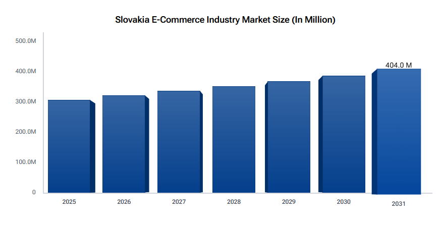
source: https://www.datainsightsmarket.com/reports/slovakia-e-commerce-industry-11080
Conclusion: A Responsive Website is Not an Option, It’s a Necessity
If you operate an e-shop and your website is still not fully responsive, you are losing customers, revenue, and positions in search engines. The data is unequivocal. Mobile traffic dominates, Google prioritizes mobile-optimized sites, customers expect a flawless experience on any device, and the competition that understands this is taking your market.
A responsive website is not a one-time expense.
It is an investment that pays off in the form of higher conversions, lower bounce rates, better search engine visibility, and stronger customer trust. And in combination with a well-thought-out UX design, it becomes the foundation upon which you can build your entire e-commerce strategy.
Don’t put it off. Every day without a responsive website is a day when your potential customers are shopping elsewhere.
Latest articles


Selected projects
Gumotex
Kategoria
E-commerce
Klient
GUMOTEX Coating s.r.o.
Trvanie
3 months

Dr. LUCULLUS
Kategoria
Custom Development
Klient
Dr. Lucullus MEDICAL
Trvanie
March 1, 2025 - present

GUMIDECK - Eshop
Kategoria
E-commerce
Klient
GUMIDECK
Trvanie
2 weeks

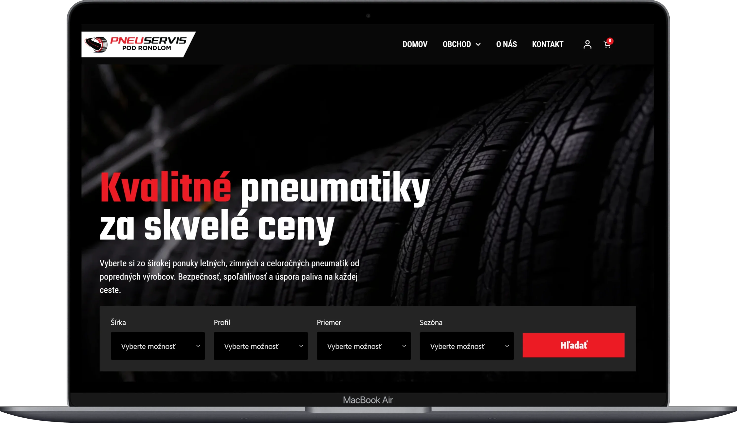
Pneugrup - e-shop
Kategoria
E-commerce
Klient
Pneuservis pod rondlom
Trvanie
2 months