Mass eShop vs. Premium Store: How Website Structure Determines Who Buys from You

Alza and Roche Bobois sell completely differently, and it's not a coincidence. The structure of the eShop, visual style, and psychological tactics must be tailored to the type of customer. Discover how to design a website that fits your product.
Mass eshop vs. premium store: how the structure of the website determines who will shop with you
There is one fundamental mistake that costs eshops thousands of euros per year. It is the belief that there is one universal way to build an online store. That what works for Alza will also work for a handmade furniture seller. Or that a minimalist design of a luxury brand fits an eshop with thousands of everyday products. The reality is that the structure of the eshop, its visual language and psychological mechanisms must be designed from the ground up for a specific type of customer and product. Otherwise, you lose conversions in places you don't even know about.
Two worlds, two types of customers
Before we look at specific structures, we need to understand who we are selling to. According to an analysis by TMO Group, there are at least six basic types of e-commerce customers, but for our comparison, two key polar opposites are essential.
On one side is the impulsive customer. They are price-sensitive, like to compare, react to discounts, and want to complete the purchase as quickly as possible. They shop on Alza, Mall or Amazon. When they see “Only 3 pieces left,” their brain switches to “buy now, think later” mode.
On the other side is the thoughtful customer. They are willing to pay more, but require time, information, and a sense of exclusivity. They are interested in the story behind the product, the quality of materials, and the possibility of personalization. They shop on sites like Roche Bobois, Bang & Olufsen or local craft brands.
These two types of customers require fundamentally different approaches. And that approach begins with the architecture of the website.

Mass eshop: speed, clarity and FOMO
Mass eshops like Alza.sk sell thousands of products across dozens of categories. Their architecture must be designed so that the customer can find a product in at most three clicks. According to SEO.com, this means a flat hierarchy with clear categories (for example Electronics > Laptops > Gaming), clean URL addresses rich in keywords, and faceted navigation with filters by price, brand, parameters, and availability.
Internal linking is critical for mass eshops. Breadcrumbs aid in orientation and crawlability. Sections like “Related products,” “Customers also bought,” and cross-sell blocks in the cart increase the average order value while also distributing link equity throughout the catalog.
But the real power of mass eshops lies in psychology. According to ConvertCart, FOMO (Fear Of Missing Out) strategies boost conversions by 20 to 30% here. What does this include?
- Low stock alerts.
- Countdowns for time-limited promotions.
- Live notifications like “5 people just bought this product.”
- Emails about abandoned carts with urgent copywriting.
- And limited packs that motivate to increase the order value.
These strategies are based on the so-called Loss Aversion Theory. According to UniAthena, people feel loss more intensely than gain. When a customer sees “Only 2 pieces left,” their brain doesn't evaluate if they need the product. It evaluates what they will lose if they don't buy it. And it is this mechanism that makes FOMO such an effective tool for mass eshops.
Alza.sk is a prime example. Orange alerts for quantities, flash sales, dynamic banners and aggressive remarketing campaigns. Everything is designed to lead the customer from browsing to purchase as quickly as possible.

Premium store: story, exclusivity and trust
A premium eshop operates on completely opposite principles. According to an analysis by ZigPoll, luxury branded stores focus on a minimalist design with generous white space, elegant typography, subtle animations, and high-quality galleries including 360-degree views and videos. No visual chaos, no flashing banners, no countdowns.
Product pages are designed as an experience, not as a catalog. Artisan videos show the manufacturing process. Material samples help the customer understand quality. AR visualization allows them to place the furniture right in their living room. And a custom configurator gives a feeling that the product is made just for them.
Here is a key difference in psychology. Premium stores actively avoid FOMO strategies. Instead of “Only 3 pieces left,” they use “Made to order” or “Limited collection.” There isn't pressure for quick decisions. There is an invitation to discover. According to IIAD, that sense of exclusivity and trust builds loyalty which translates into higher average order value and repeat purchases.
Navigation is intuitive, yet encourages exploration. Thematic paths (for example Modern Living > Sofas > Custom Upholstery) guide the customer deeper into the offering, where each level adds another layer of story and details. Roche Bobois is an example of this philosophy. According to Harper's Bazaar, their website prioritizes 3D views and consultation services over quick purchases.

And what if you are neither of these?
Most eshops don't fit neatly into either the mass or premium category. According to BlackBelt Commerce, there are at least seven basic archetypes of e-commerce websites, each requiring a specific approach.
Subscription stores (like beauty boxes or regular coffee deliveries) need a dashboard for managing subscriptions, progress bars showing the status of the next delivery, and slight FOMO elements like “Last day to edit your box.”
Dropshipping and marketplace platforms operate similarly to mass eshops, but with added vendor pages, a review system, and live notifications about sales which build social proof.
B2B and wholesale portals are a completely different world. According to 5MS, here FOMO has no place. Customers need detailed specifications, the ability to download technical documentation, login to an account with individual pricing, and inquiry forms. The decision-making process is long, rational and often involves multiple people.
Eshops with digital products (courses, software, templates) have a simpler structure, but must invest in quality samples and previews. Urgency works here through time-limited access, not through stock levels.
And finally, niche micro-sites are eshops with a narrowly specialized range. According to EcommerceMVP, this works as a hybrid. A small catalog with a premium presentation to build loyalty, but with FOMO elements for trendy products.

The ethics of FOMO and the Slovak reality
One important note. FOMO strategies work, but they also carry risks. According to an article on LinkedIn, the line between effective urgency marketing and manipulation is thin. And within the EU, there are specific regulations that prohibit false scarcity, that is, displaying “Only pieces left” for products of which you have hundreds in stock.
For the Slovak and Czech market, this means that all urgency elements must be true. False countdowns that reset after expiry or artificially reduced piece counts in stock can put you in conflict with the EU consumer legislation. Moreover, customers are increasingly sensitive. If they find out that your FOMO is staged, the loss of trust is irreversible.
Mobile traffic decides for both models
No matter whether you operate a mass or premium eshop, one rule applies universally. According to current data, over 60% of e-commerce traffic comes from mobile devices. This means that the entire architecture, visual design and conversion elements must be primarily designed for mobile screens.
For mass eshops, this means that FOMO elements must be legible and not obscure the main content. For premium stores, this means that immersive galleries and AR features must work smoothly on less powerful devices as well. Prototyping in tools like Figma with a mobile-first approach and subsequent testing through heatmaps will reveal where customers lose interest or encounter problems in navigation.
Conclusion: the right structure is not about taste, it's about strategy
The way your eshop is constructed is not aesthetic decision. It is a strategic decision that directly affects who will shop with you, how much they spend, and if they will return. A mass eshop needs speed, clarity, and psychological triggers that transform browsing into a purchase. A premium store needs space, story, and a sense of exclusivity that justifies the higher price.
And if you are unsure where your eshop fits, ask yourself a simple question. Do you want the customer to click “Buy” within three minutes? Or do you want them to spend half an hour on the page, fall in love with the product, and then pay three times more?
The answer will tell you what architecture you need.
METINAS custom eshop creation
Every eshop is different. A mass store with thousands of products needs a flat architecture, lightning-fast loading and conversion elements that convert browsing into a purchase. A premium brand needs space for story, immersive galleries and design that justifies the higher price. The problem is that template solutions do not distinguish between the two. We do. METINAS builds e-commerce solutions and websites from scratch, tailored exactly to who your customer is and what you need from them. From the structure, to conversion mechanisms, to the technical foundation that holds the entire system together. Because the right architecture is not about taste. It's about strategy.
Latest articles


Selected projects
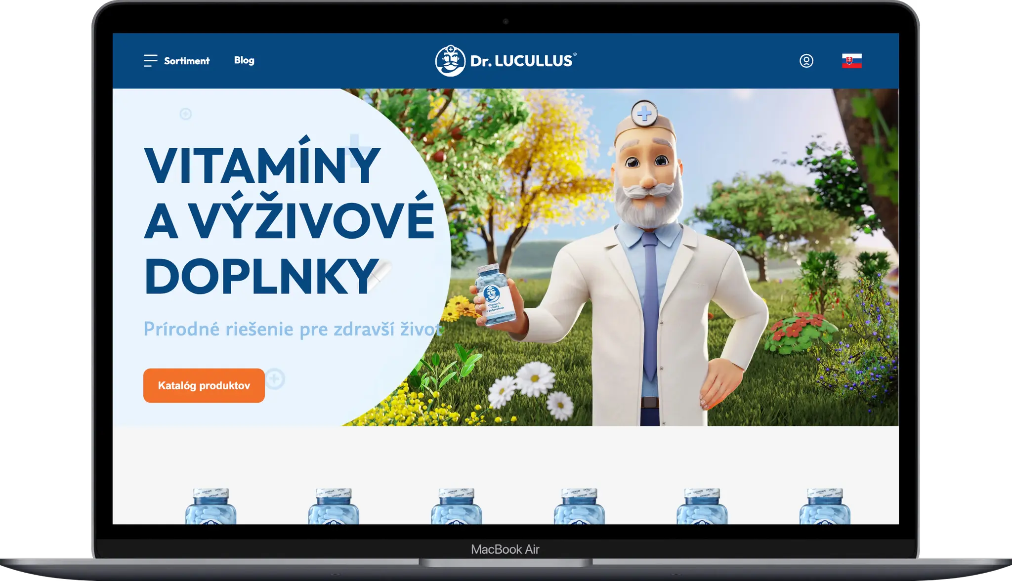
Dr. LUCULLUS
Kategoria
Custom Development
Klient
Dr. Lucullus MEDICAL
Trvanie
March 1, 2025 - present
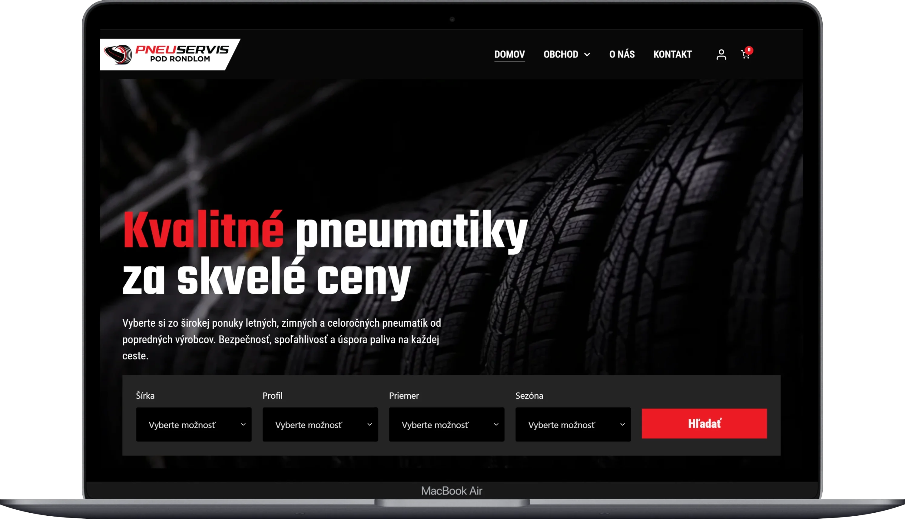
Pneugrup - e-shop
Kategoria
E-commerce
Klient
Pneuservis pod rondlom
Trvanie
2 months
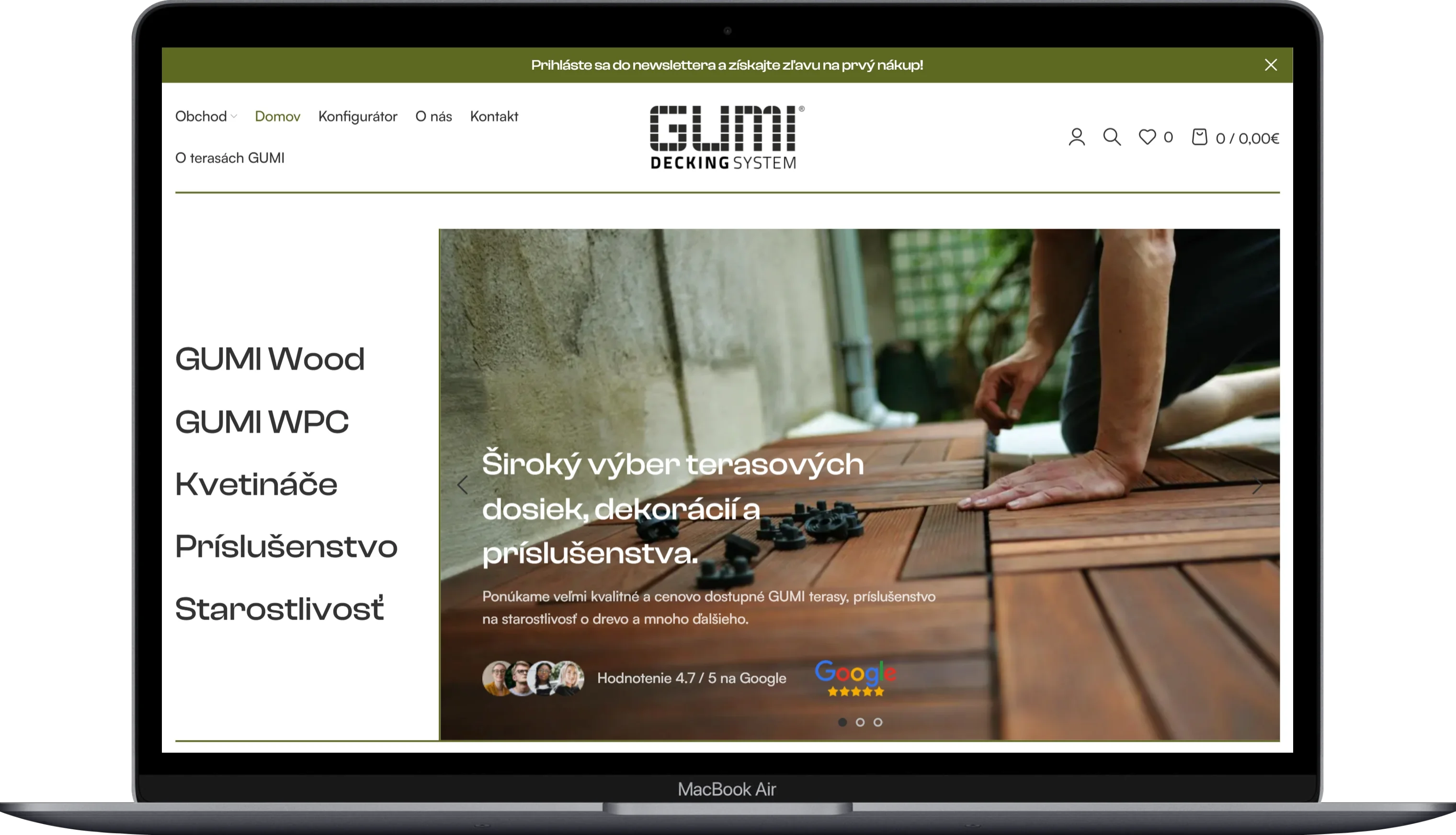
GUMIDECK - Eshop
Kategoria
E-commerce
Klient
GUMIDECK
Trvanie
2 weeks
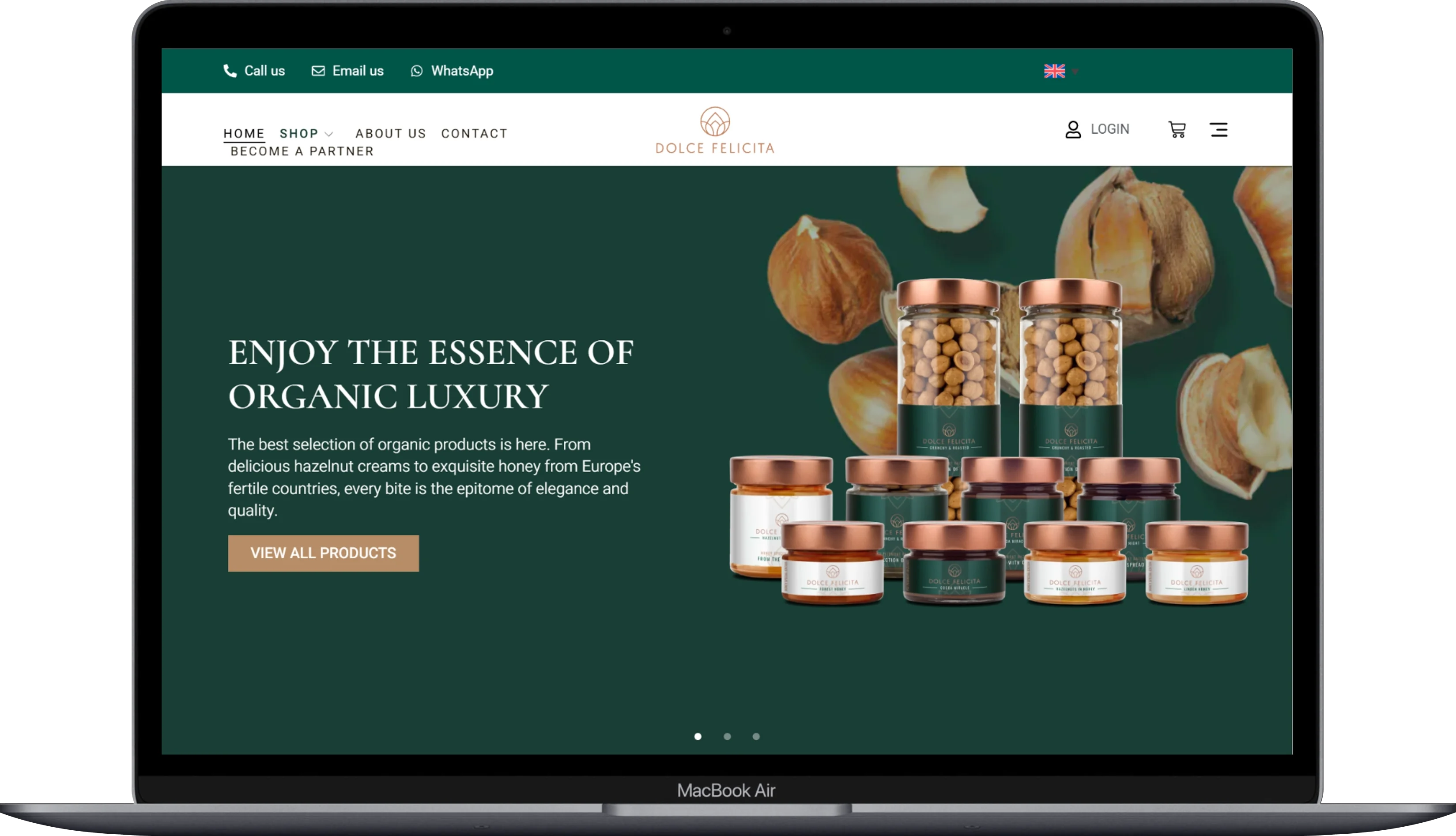
Dolce Felicita
Kategoria
E-commerce
Klient
Dolce Felicita
Trvanie
5 weeks